news Starting Up

news

Convergence

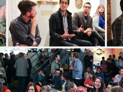
On Thursday, two hundred or so members of the Seattle design community gathered at MakerHaus for Convergence, a panel discussion about where ID + UX design meet. Tactile put this event together to give independent designers, students, industry folks and others the chance to connect and consider the constant evolution of design. The discussion ranged from defining UX to the business of design, as well as what it takes to succeed in a hybridized industry. Convergence was clearly just the beginning of the conversation—we look forward to continuing it soon! Thanks again to our panelists, volunteers and all who attended.
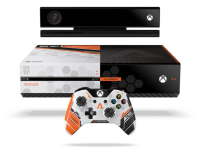
news

Titanfall

Titanfall has landed. We’re excited to play the most–anticipated game of the year—and to pick up the limited edition Titanfall Xbox controller. Tactile has been a long–time collaborator with Xbox, and this project let us peek behind the curtain during the development and launch of Titanfall and work directly with both Respawn Entertainment (the game developer) and Xbox’s internal industrial design team. Tactile Design Director Rich Hanks commented, “It’s great to design for such an enthusiastic user. Every detail is meaningful to the core gamer, so authenticity is key. The result has to have a ‘wow’ factor—something that will inspire someone to save up and wait in line the day it hits the shelves. We had to create a must have product for the Titanfall fan.” For this fast–paced graphics project, the Tactile team immersed itself in the world of Titanfall. The controller, like the game, has a future military feel, with direct references to one of the game weapons that is sure to be a player favorite. Our team’s challenge was preserving the integrity of the Xbox brand language while integrating the excitement the game offers. This meant incredible focus on detail, down to constant iteration on the perfect shade of Militia orange. With each limited edition Xbox controller we touch—Tactile collaborated on the Tomb Raider version in 2013—we learn new production processes and build experience we can bring to clients across other industries. We also love working with the Xbox ID team for their consistently high standards of quality and execution. It’s a great fit for the Tactile team, too, which is uniquely suited to intense CMF (color, material, finish) efforts that require high–level graphic attunement. It doesn’t hurt, either, that we have deep experience with Xbox gamer culture. Xbox is quickly becoming the center of entertainment for families. For us, limited edition controllers present a unique chance to design for serious gamers while making sure the result is accessible for every player. Working on graphics for the Titanfall controller is just one great experience in a long history of collaboration with the Xbox team. They are as passionate as we are about details, and we can’t wait to see what’s next.

news

STREETVIEW PART I

Stuck card, connection failure, redundant charges—nearly every Seattle driver has had a frustrating experience with a parking pay station, including everyone on the Tactile team. So when the Seattle Department of Transportation (SDOT) announced their plan to replace 2,200 parking meters over the next two years, we took note. Then, when they installed seven trial pay stations along Fourth Avenue—literally in our front yard—with a request for public feedback, we got excited. We wanted to understand why Seattle is investing in a parking meter overhaul in the first place. According to Project Lead Margo Polley, SDOT purchased a few rounds of pay stations over the last decade that simply haven’t held up to network demands and necessary upgrades. The city definitely feels some buyer’s remorse. While some of the meters appear new, most are more than eight years old and no longer connect reliably to process payments (thanks to outdated modems and low-bandwidth networks). SDOT had to beg the city council for $450,000 in 2013 for an urgent modem patch, and they’re trying to avoid sinking more city dollars into technology that will quickly become obsolete. Now they’re searching for a pay station that will not only meet the city’s basic needs, but also hold up for at least a decade. The Tactile team designs tools that are both functional and attractive, with a heavy focus on creating a fluid, intuitive user experience. This applies to medical devices, professional–grade oscilloscopes, video game controllers and daily–use products not unlike our city parking meters. While constraints vary from project to project, the same principles of simplicity, ergonomics and intuitiveness apply across the board. Armed with these principles, we headed downstairs to Fourth Avenue to get to know the seven proposed pay stations. On first glance, it was clear that SDOT was attempting to offer drivers more options, but we felt that most of the seven prototypes missed the mark in terms of usability. Issues we observed included: •  Feature creep—in trying to add a QWERTY keyboard, more time options and shortcuts, all of the pay stations ended up feeling cluttered. As a result, the primary function got lost and users ended up feeling overwhelmed. •  Inconsistent visual language—most of the pay stations had a mess of colors, button shapes and stickers, all of which created confusion. Icons seemed arbitrary, too, with no symbols in common with other Seattle signage. •  Weak information architecture—aside from hard–to–read type both on–screen and on the buttons (forget trying to read them at night), one of the biggest challenges we saw was a lack of visual organization and interaction flow. None of the pay stations presented a bold, simple set of 1–2–3 instructions for selecting time and payment that felt intuitive. There were extraneous buttons in strange places, or arrows pointing to other buttons that suggested reading more instructions on-screen—not exactly a clear and quick directive. •  Poor haptics—though it might seem like a minor detail, more responsive buttons would help assure the user that their selections have registered correctly. A “solid” button feel and tactile feedback could mean the difference between an error–free ticket purchase and accidental overpayment. Of course it’s easy to see what isn’t working. Next, we want to learn more about the physical constraints, supplier options and necessary features that are driving the new pay station prototypes, and offer some constructive feedback. We love contributing to the conversation about something so close to home—and the “user experience” of a city we’re passionate about.

About Us

We believe great tools cultivate meaningful experiences that can improve our working and living conditions. We’re guided by the principle that functional should also be beautiful and enjoyable. For over 15 years we’ve relied on building trust and collaborative relationships with our clients to do just that.

Learn More
Designer Sketching