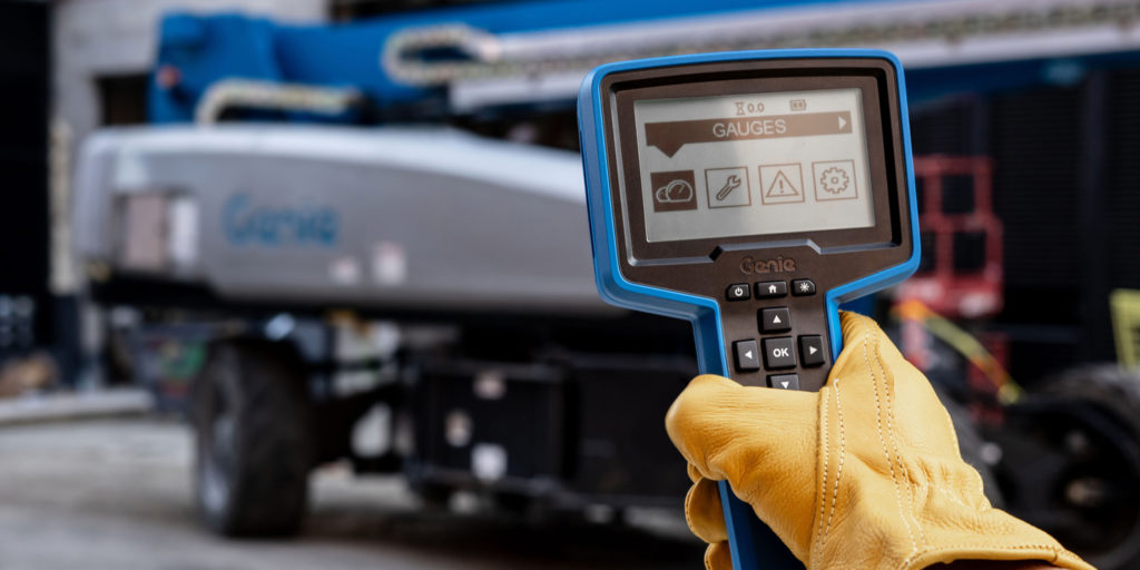
As a product design agency, our clients at Tactile come to us with a wide array of projects. They range from designing specialized medical equipment to high-grade tools for construction and gaming. What makes Tactile unique is our approach in weaving together physical and digital design solutions. With this holistic approach, it’s our mission to craft meaningful products with lasting relevance and impact.
A huge part to achieving our product design mission is our dedication to having a comprehensive UX strategy. It’s our toolkit to create products that are not only functionally-relevant, but also beautiful and enjoyable. But first, let’s take a small dive into what UX is and it’s value to physical-digital product design.
“UX is our toolkit for functionally-relevant, but also beautiful and enjoyable products.”
The Value of UX Design
The exponential growth of UX design in the past decade has led to some understandable confusion of what “UX” actually is. Some of the confusion lies in the broad reach of the discipline. In certain circles, the term can be a catch-all for digital-design. In other physically-minded circles (industrial design), it encompasses usability, which was already considered long before the term “UX” ever existed. Here we’d like to highlight what it looks like at Tactile.
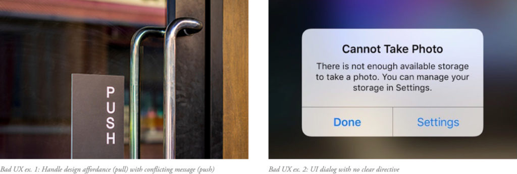
User eXperience design is simply about defining the experience of a person using a product or service. Great experiences are ones that are positive, and may not even be noticed. Yet when an experience isn’t working properly, it can be very noticeable:
Donald Norman coined the UX term for his own role as a cognitive scientist with Apple in the early 1990s. He said this: “I invented the term because I thought human interface and usability were too narrow: I wanted to cover all aspects of the person’s experience with a system, including industrial design, graphics, the interface, the physical interaction, and the manual.”
“cross-pollinating thought… rather than endlessly siloed disciplines.”
Norman’s desire was to see cross-pollinating thought for better products, rather than endlessly siloed disciplines. Taking his idea and updating it a little, you’d get a Venn diagram of the UX field which would look something like the image below. (If you crave a version with even more detail, here you go.)
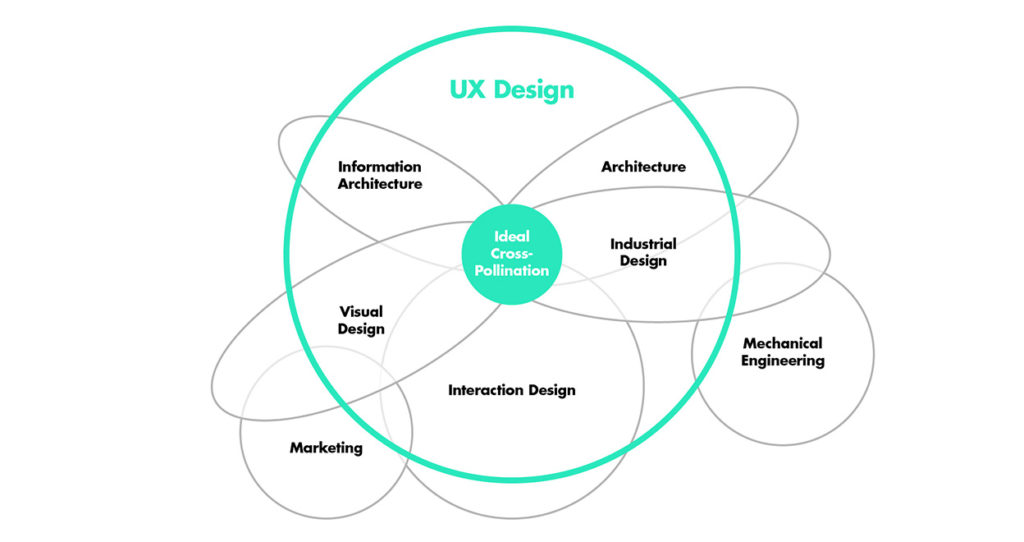
So UX design is really a broad category for systems-level thinking. One which examines the full experience of a product from usability and task efficiency to its perceived value and so forth. It’s not merely focusing on one design discipline or another, but how they interact together.
UX isn’t limited to physical or digital design. Because of our agile team sizes at Tactile, physical and digital designers work together from the start of each project. This encourages an open space in our process to allow all designers to feel that they can explore beyond any one discipline. The value of our UX designers comes when they can design the details, yet also see the total sum of the physical + digital parts.
Tactile’s Unique Approach
One aspect of Tactile’s uniqueness is our specialized focus on blended physical-digital UX design. Another part is our methodology of achieving success in UX. To do so we must look underneath the hard skills to discover the soft-skills driving them. Our strategy involves seeing the context of each scenario and moving forward with a collaborative harmony.
Context Clues
Even though understanding context and user intent are foundational parts of UX design, designers can overlook them when they aren’t careful. It’s easy for designers to get excited about one initial idea and run with it without exploring different perspectives, or listening to the users. Exploring starts with research, yet we like to think of it as a conversation. Our informal and empathetic approach reminds us that our work is human-centered. Understanding the context of how people engage a physical-digital product can have major implications for the design process.
When we were designing a real-time biopsy scanner for pathologists, it went well beyond mapping out a theoretical path from sample to result. It meant diving headfirst into their environment. We looked at what happens in the lab with a physicians’ workflow. Ahead of all, we discovered time is a critical factor in handling samples. Any way we could improve efficiency would make their job easier. And while observing, we noticed how the gloves the physicians wore could affect device interactions. With these elements of context in mind, it informed our opinion that the interface needed to be elegant — not too simple and not overly complicated.
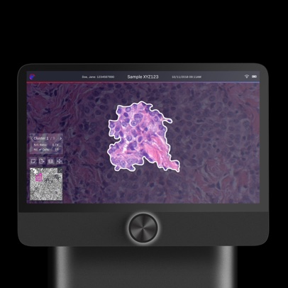
These are the physical-digital details seen through a balanced UX approach. The end result was a single physical knob, and a digital interface which stripped any clutter to show only relative information. By drawing on the context of a person’s environment and workflow, we solve relevant problems and create better products.
Collaborative Harmony
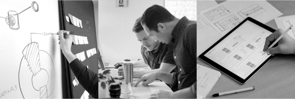
Context is like playing a song in the right key. Once the team knows the right key, designers feel complete freedom to explore within it together. Our physical and digital designers still focus in their core domains, yet when they cross-pollinate ideas, the solutions become stronger. Good ideas can formulate with one person, but they get even better when adopted by a team’s vision.
Our type of collaboration looks a lot like harmony: different voices coming together to make one. Harmony is playing while also listening to your partners, and it takes practice and trust. This isn’t done just because we’re a small, agile shop, it’s part of the culture we’ve developed at Tactile. We don’t follow the “over the fence” design model, where siloed departments constantly flip the coin of work. Instead of emailing, we walk over to another person’s desk and keep the conversation going. These small steps across the office to collaborate creates an environment where everyone feels they have ownership and a voice in the matter.
Saint-Exupéry sums up this idea well, “If you want to build a ship, don’t drum up the men to gather wood, divide the work, and give orders. Instead, teach them to yearn for the vast and endless sea.”
One Product at a Time
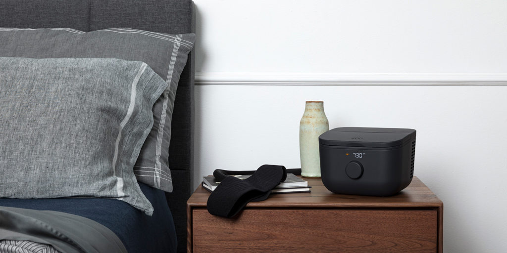
UX Design is an umbrella discipline that promotes the overlapping of ideas to create a meaningful and enjoyable product experience. It’s not digital versus physical or a THIS / THAT mentality. With UX at Tactile, we holistically see one product as one tool to improve lives. And we do this with our combined Physical + Digital approach, supported with understanding context through collaboration.
At Tactile, we build enjoyable experiences where functionality and beauty come together, focused on people.
