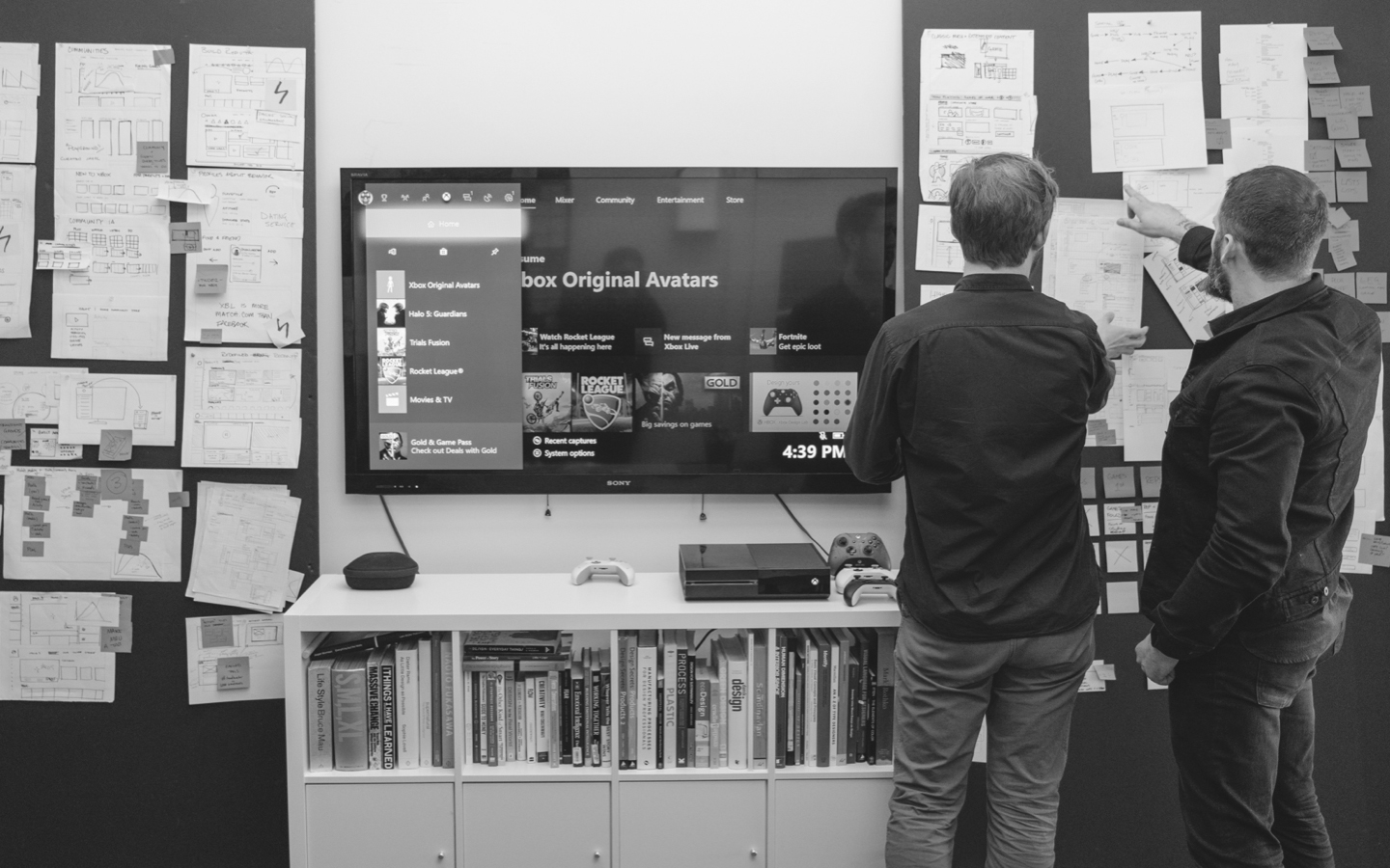
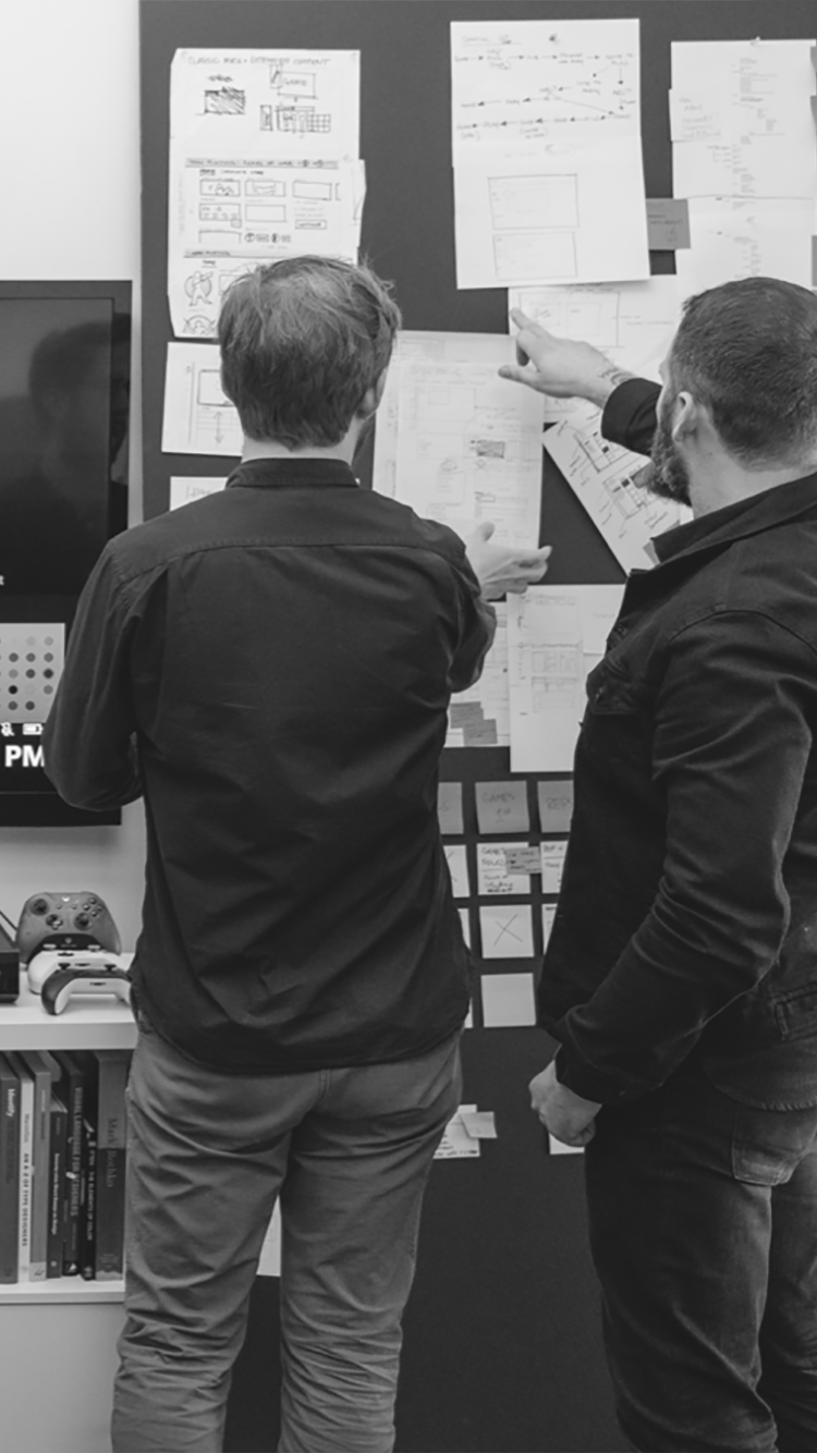
At Tactile, we believe exceptional user experience shouldn’t just be for high-end consumer products. As more and more professional tools integrate screens and interactive technology, there is a need for UX that meets the exacting standards of the workplace while also supporting the needs of the user. Our methodology focuses on uncovering insights, establishing context, and understanding feasibility to better design relevant tools that solve real-world problems.
Research Geared for Insights
Collaboration is central to the design process at Tactile. Early and persistent communication between teams and stakeholders builds relationships of trust and understanding. This foundation cultivates an environment where free thought, probing questions, and challenging ideas can build a path toward a better product and experience for the user.
Every user group is unique, and our research methods are built around identifying those unique needs. Our technique involves intently listening, planning, and adjusting to get to the heart of the opportunity or user problem. For example, discussing and identifying pre-existing pain points in an experience is a good way to kickstart a conversation about project goals and strategy. These conversations cultivate consensus and unity with everyone involved in the project. Following up with an audit of user tasks, needs, expectations, and thought processes may spur deeper conversations that extract valuable insight into the experience we aim to create. This conversational approach to research enables us to learn faster and in a more human-centered way.
At Tactile, we specialize in balancing the needs of the user with the real-world business needs of the client. We understand that sometimes there are constraints that just can’t be avoided. We are experts at finding ways to secure user wins while navigating accelerated timelines, manpower limitations, budget caps, and legal concerns.
“We specialize in balancing the needs of the user with the real world business needs of the client.”
A successful user experience project has a measurable impact, whether qualitative, quantitative, or a mix of both; if not already set, these metrics are determined based on the goals established with the client during the first phase. For example, identifying pain points in an existing experience is a good way to start a larger conversation about project goals. An audit of user tasks, needs, and expectations, as well as their feelings and thought processes, can yield surprising results that may help reframe the problem and opportunity.
We blend our creative intuition with a collaborative process proven to provide insights that add lasting value to products. We conduct user interviews, survey competitive landscapes, and audit existing experiences to help us learn more faster. Our research phase is quick but mighty and can save time in subsequent phases by providing clear insights, perspectives, and goals that help focus our exploration and define any constraints.
Focused Exploration
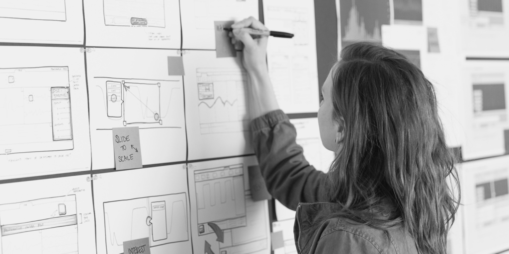
The exploration phase is where findings uncovered in our research begin to take shape. We believe the first solution is rarely the best solution, so we don’t settle for just any answer to the problem. Our rapid ideation method challenges us to find many viable solutions to discuss each one’s potential with our clients.
This might include restructuring information architectures, drafting alternative user journeys, and building simple mockups to test ideas as we go. We may mock up interactive wireframes to pressure test an interface or help convey a complex concept.
Build, Test, Repeat
Our ideas are not precious, and when they break, we learn something. Does the interface behave in a way that the user expects? Does it help them do what they set out to do in the first place? Does it add delight and value to the overall product experience? These questions keep our efforts focused and will recenter a detailed conversation.
At Tactile, we aim to foster an environment that encourages participation and imagination without stifling or judging. We believe the best ideas highlight our diverse backgrounds and collective expertise. When we do this, our exploration can yield unexpected discoveries—an important ingredient to the success of the products we design.
Refinement + Finesse
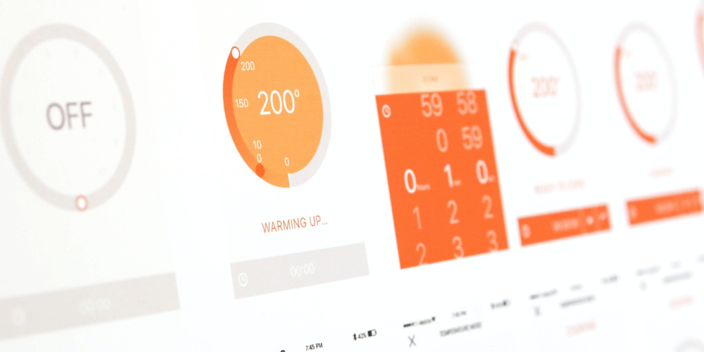
While exploration is about generating many concepts, refinement is about finessing one or two. The end goal of the refinement phase is a single, fully developed concept that not only has buy-in and support from users, stakeholders, and designers alike but is also realistically achievable within the constraints of the business world.
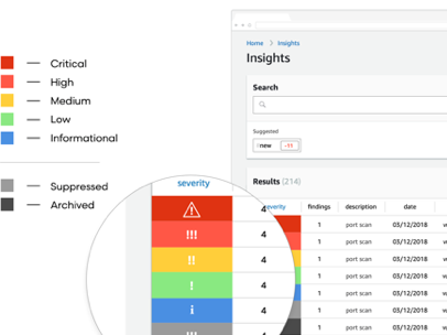
This is the time in the project when we develop a distinctive look and feel for a product. Visual Design is a set of aesthetic choices that not only impact the visual impression but boost usability by emphasizing information hierarchies, giving functional cues, and delivering appropriate feedback to the users. These aesthetic choices give a voice and identity to the digital products Tactile designs, ultimately making them easier and more enjoyable to use.
Though visual design can deliver the emotional side of a product, creating a graphic system is still grounded in real-world tests and observations. We carefully select color and typography based on brand guidelines and realistic constraints: screen limitations such as resolution, density, and brightness; technical specifications such as processing power and memory; and real-use factors such as lighting conditions, operating distance, and additional equipment such as gloves, glasses, and peripheral devices. These decisions may then be verified with a round of validation testing that ensures what looks good also works great.
Development + Deployment
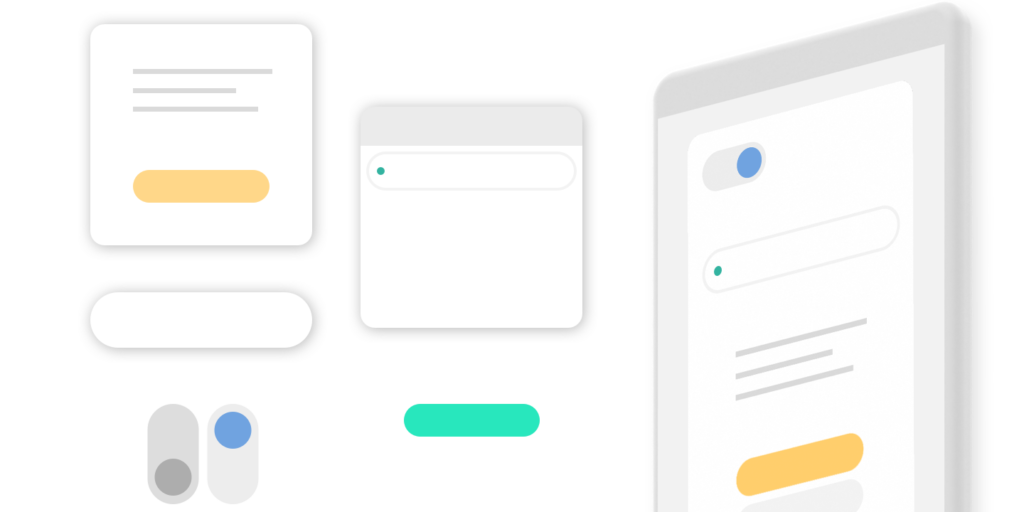
Deploying a digital product is like conducting an orchestra of work disciplines. There are many players (musicians) on separate teams (sections) who need to come together in the right ways at the right times to present the best experience. One of the most critical relationships in this deployment orchestra is that between the design team and the development team. Developers can only interpret our work as accurately as the designs have been documented. That’s why we cozy to developers to make sure the transfer and interpretations of our designs are spot-on. We specially curate our source files. We meticulously maintain symbol libraries, color palettes, and usage guidelines to ensure that our documents are usable to people outside our office.
If there is motion or animation or more complex interactions, we can provide prototypes and animation examples. We use tools like Zeplin for interactive redlines, in-context details, and downloadable assets to ensure there’s never lost time or confusion about intent or layout. This is especially useful when working with dispersed teams or resources abroad.
“We cozy up to developers to make sure the transfer and interpretation of our designs is spot-on.”
Our designers love to annotate, and we always encourage in-context dialogue and critique. We don’t want developers to have to make guesses or be the designers, so we make ourselves available. Open conversations between designers and devs help everyone feel less protective of their work and enable us to make last-minute adjustments.
At Tactile, we take pride in the production details so our clients don’t have to swim through a mess of files and disjointed deliverables. If there are questions or something is missing, we make ourselves available so they can interface with us directly and immediately. This helps curb situations where something was implemented incorrectly. We do our best to be flexible in our methodology to ensure the implementation team has everything they need so that the original design intent gets into the hands of users.
Tactile believes that good relationships are built on openness and genuine curiosity.
As your partners in design, we promise to ask the right questions, explore the possibilities, and find the best solution to your needs, with user empathy at its core.
