Sitting in Motion
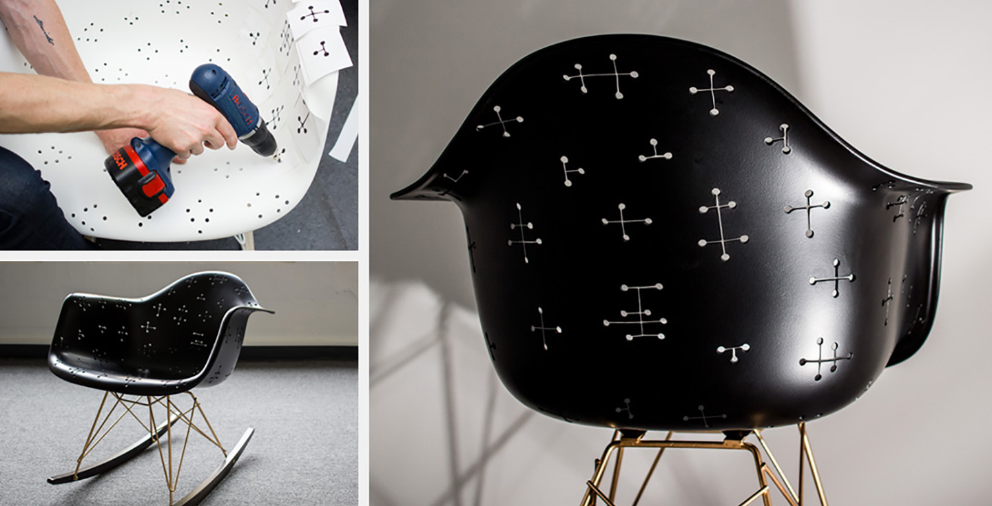
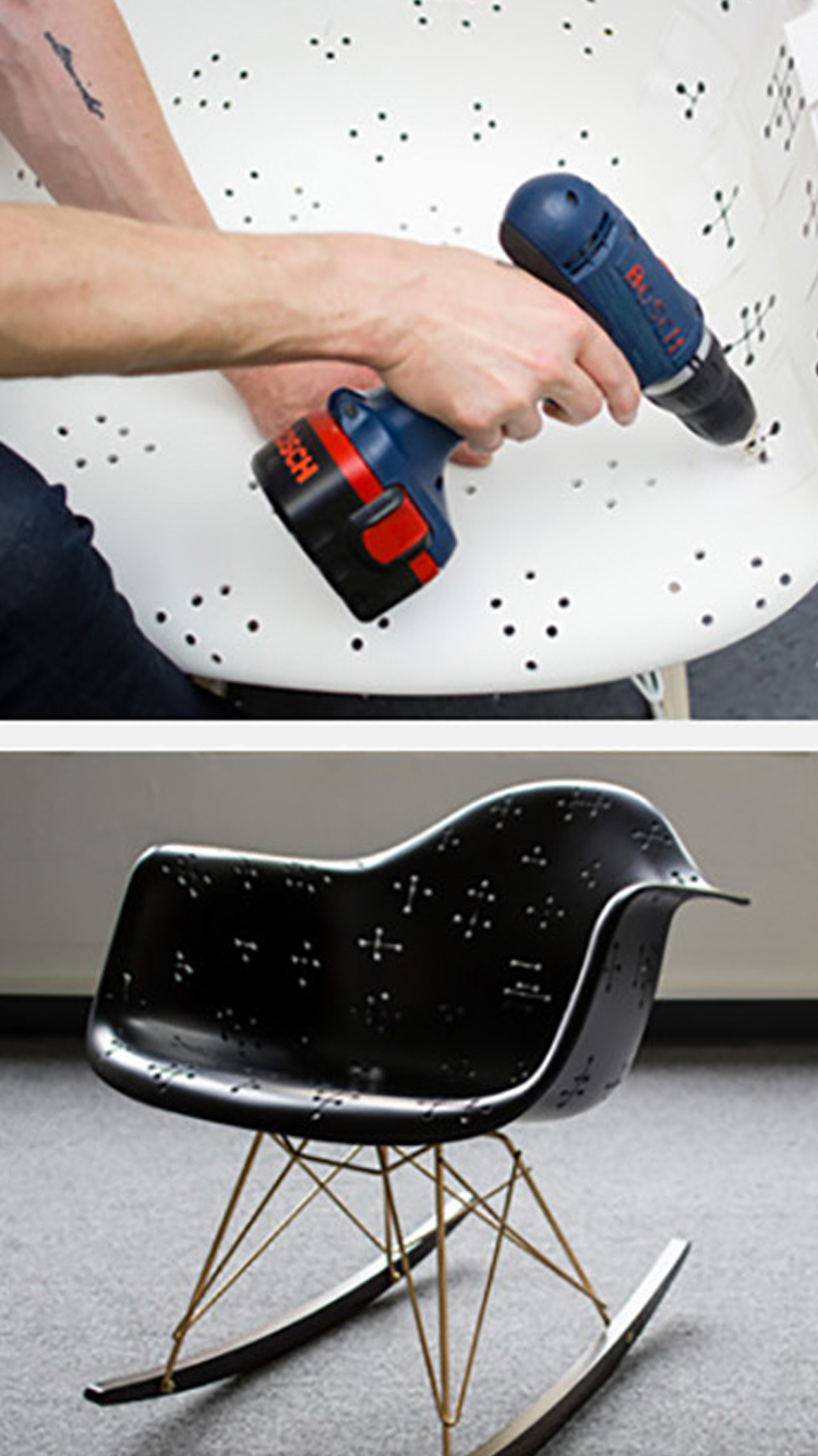
September 25, 2014Tactile was pleased to take part in a special design effort for the Closing Party of the 2014 Seattle Design Festival. Herman Miller donated 10 Eames rocking chairs (fitting the Design in Motion theme of the festival) for local design firms to customize, then auctioned them off to benefit youth creative organization Sawhorse Revolution. The Tactile design team went for a classic mahatma dot pattern beloved by the Eames’, accented with a gold frame and dark-stained rockers. Our chair went home with the NBBJ Architecture crew—but perhaps we’ll reproduce one to decorate our studio…
Where are we now?
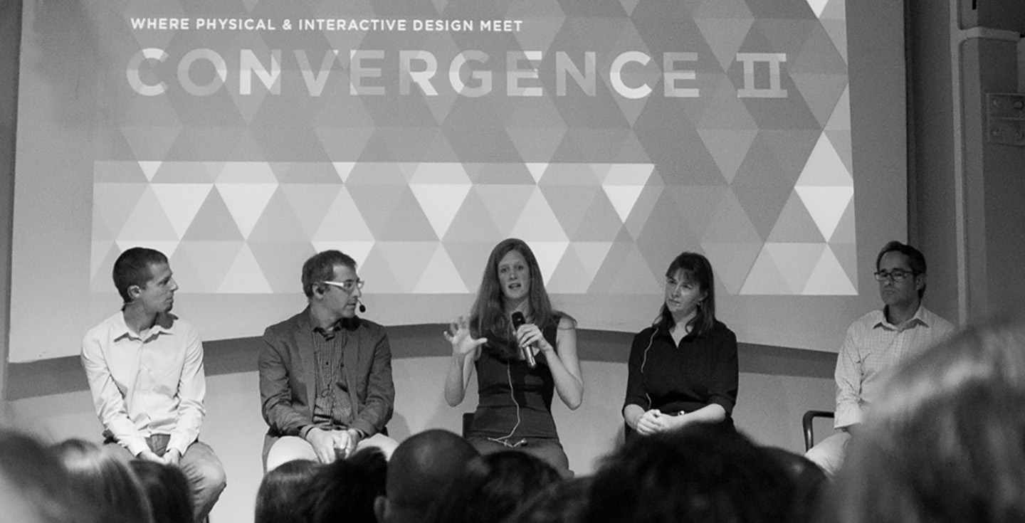
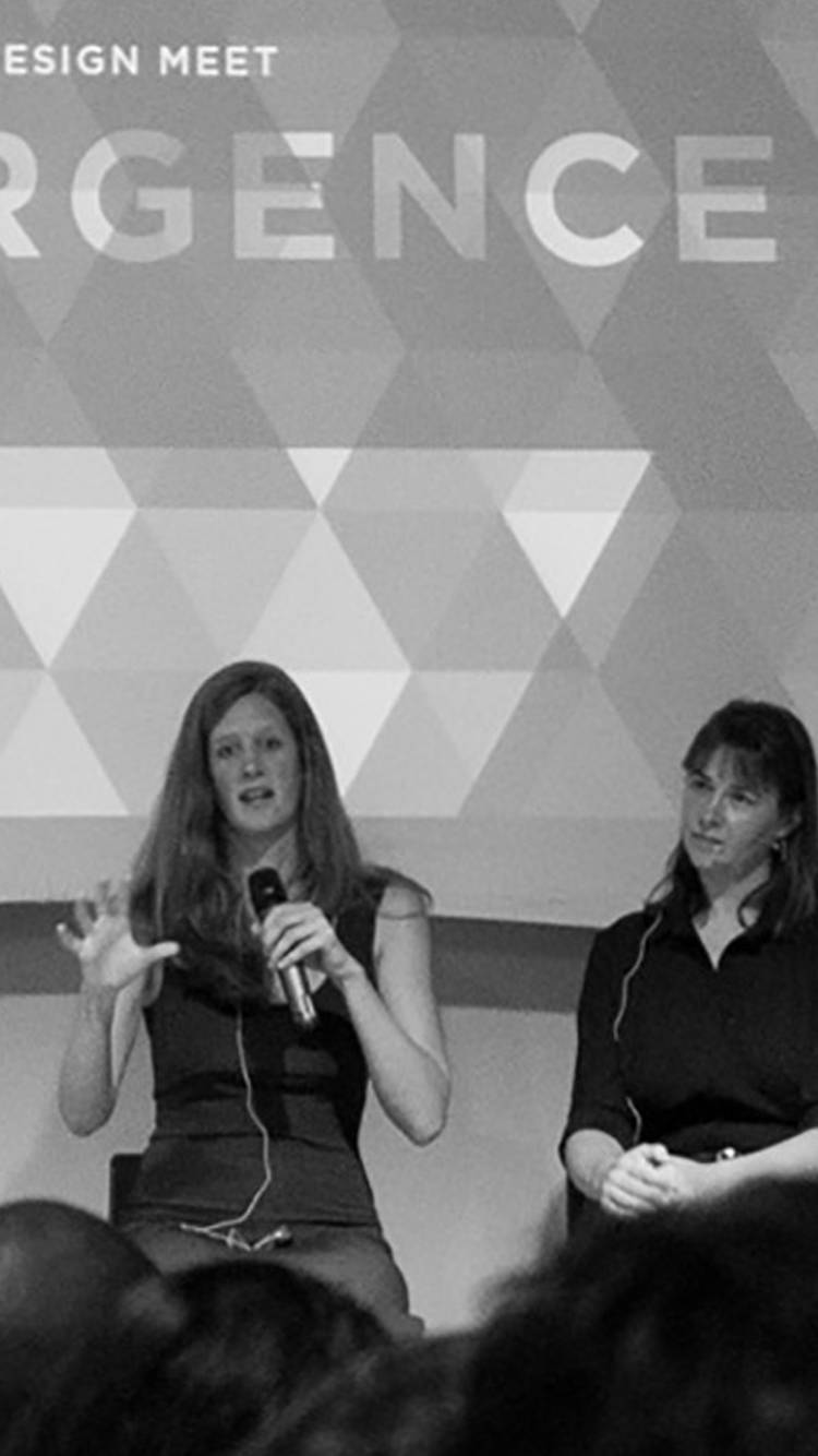
September 23, 2014The Convergence II event brought together designers, architects, students, entrepreneurs and more to discuss the widening needs of users and the challenges/opportunities in designing for them. Our four speakers—Martina Welke (Zealyst), Dominic Muren (The Humblefactory, UW, Alchematter.org), Dave Simon (Herman Miller), JoAnn Wilcox (Mahlum Architecture)—brought diverse experience to the question of where we must collaborate and how to bring the tools and disciplines together with intention. Thanks to everyone who attended and supported this great community discussion; we’ll see you at the next one!
Platform for Design
September 9, 2014Designers, alongside engineers and marketers, are increasingly tasked with adapting a brand or product experience across multiple platforms. Developing a product now means integrating not just hardware and software—but also creating for mobile, gaming consoles, desktop computers, tablets and more. Join us in asking leaders from key consumer companies like Microsoft, Valve, HTC and Amazon: How do you adapt to the consumer universe? What are your greatest challenges and opportunities? Learn more about this joint Microsoft–Tactile effort on October 2nd and get your tickets today.

Upcoming Events
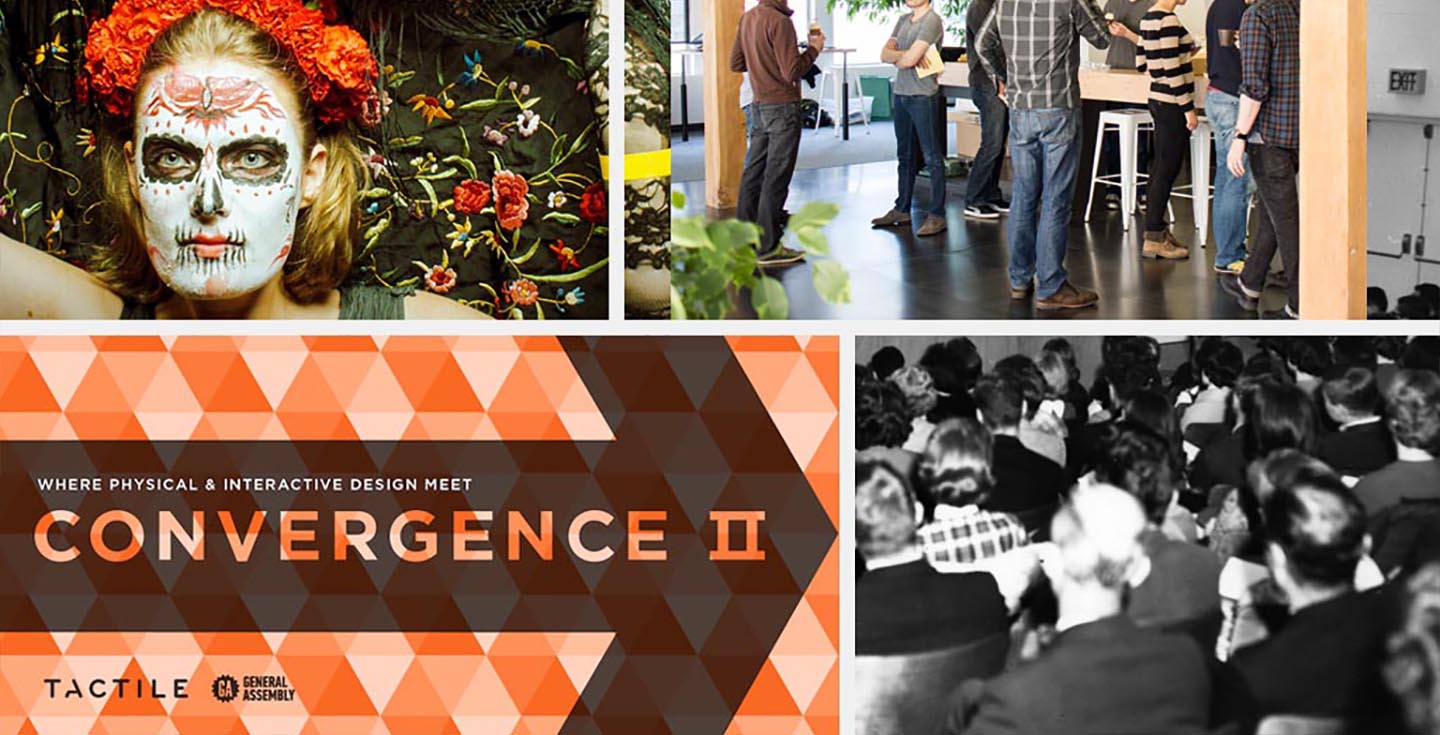
August 12, 2014Fall 2014 will bring some great opportunities to engage with Tactile and our Seattle community. We’re co-producing two events around current design topics: “Convergence II” with General Assembly (yes, the education institution) on September 17, and “Design for the Consumer Universe” with Microsoft on October 2. Our famed annual Halloween party is right around the corner, too—which means it’s never too early to start considering costumes. Registration is free and open for both panel events and we hope to see you there.

New Kids on the Block
August 5, 2014

Premium
July 22, 2014Last week, we began collaborating with a new client on their first foray into hardware development. They have a very well–respected name in the interactive space, synonymous with quality. Of course, they want their first physical product to authentically represent their high–end brand. Which led to a conversation about what, exactly, does it mean for a product to be premium?
For this particular device, we might indicate premium status with a high price point, luxe materials or thoughtful features (or some combination thereof). Our key question here is, what would this client’s hyper–loyal users consider premium? Our client already has deep knowledge about their customers’ behaviors. With the addition of research, testing, and iteration, we can help them gain a fuller picture of the physical product experience that will meet or exceed their customers’ expectations. Our client will likely have to make a few tough choices about what’s feasible in this first endeavor. In the end, though, the customer will pick up this beautiful, top–quality new product and immediately feel it was created just for them—because it was.

Design Fest Discourse
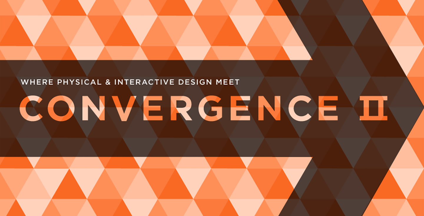
June 30, 2014We’re thrilled to announce Part II of our Convergence panel series. “Convergence II: Where Physical & Interactive Design Meet” will take place on Thursday, September 17, 2014 at Impact Hub Seattle as part of the Seattle Design Festival. We’ll bring together industrial and UX designers, architects, urban planners and more to explore the challenges and opportunities of designing for every type of space. Register for this free event—with a deconstructed panel format—at https://convergencetwo.eventbrite.com and tell your friends and colleagues! We’ll see you in September.


Healthy Anticipation
June 9, 2014The internet was abuzz last week with the announcement of Apple’s Health app and HealthKit data repository—and the multitude of hardware and software integrations likely to follow (like the one with Cue, a “personal molecular-level testing device, which can give you an instant read on your influenza status). Aside from Health’s mass appeal, the most notable news to us is Apple’s collaboration with big healthcare players like the Mayo Clinic and EPIC. EPIC, the 800-pound gorilla in Electronic Health Records software, began pulling data from popular tracking devices like Fitbit and Withings into its MyChart for patients a few years ago. Still, health information interfaces for both providers and consumers, like EPIC’s, remain clunky and substantially less usable than your typical smartphone app. Apple’s foray into health management represents an opportunity for EPIC to stay at the forefront of the data revolution. It remains to be seen, though, whether a partnership with Apple—known for its focus on brand and an elegant user interface–will influence the day-to-day experience of accessing health data beyond the smartphone.

Bulls Eye
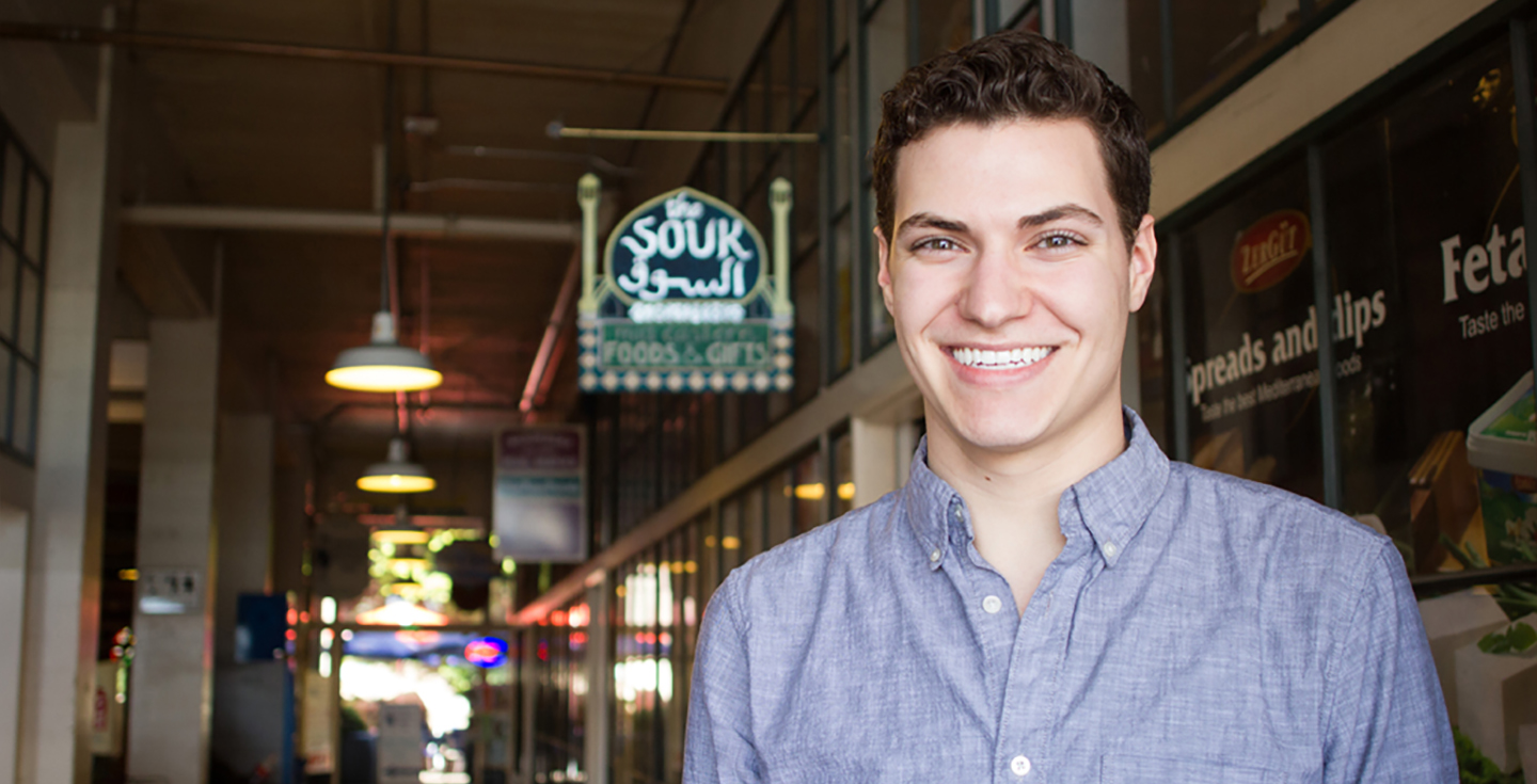
May 21, 2014With the arrival of May came a fresh face at Tactile: Aidan, an energetic and laser-focused Industrial Design intern. Following his junior year at Western Washington University, Aidan took a year off to work on advanced concepts in mobile audio at Bose in Boston. He had his eye on Tactile’s nimble, intimate studio environment ever since a student tour two years ago, and he’s jazzed to work on products he’ll actually see through to market. Equally excited about research, synthesis and sketching, Aidan is eager to understand the big picture of marketing + engineering + design + strategy. When he’s not soaking up design wisdom (or, ahem, learning opportunities), Aidan loves to write, photograph and visit museums—and he just happens to be a champion archer.

All Over the Place
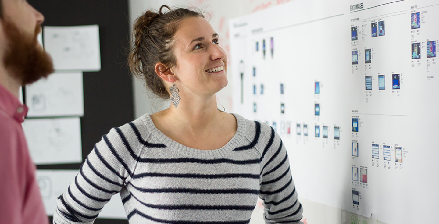
May 5, 2014Meet savvy UX designer Kim Gladow. A Western Washington University grad, Kim is the very definition of versatile. She produces, shoots and edits beautiful videos; she creates sophisticated interface architectures; and she’s a talented graphic designer and front-end developer. What’s more, Kim is equally comfortable shaping UX strategy with key consumer clients and building out visual identity assets for industrial equipment interfaces.
“I love working on projects that disrupt the normal or expected. I have the most fun designing across platforms and disciplines (ID + UX, video + UX) within a single project. In those instances, function governs form and content dictates the platform—and it’s interesting when the outcome is not just a website, but an entire system.”
Kim cites Seattle as a compelling place to be involved in UX because design here is often about relevance over novelty. “Sometimes it’s about innovation. Often, though, it’s updating design for industries with 10–20 year product iterations; they’re not as deeply connected with design, so they’re thrilled with something that’s new and better than before—and it sets them on a brand new path.”
When Kim’s not tackling a multipart project, she’s playing ultimate frisbee in a weird costume, traveling or crushing on cephalapods.