
news
Premium
news
Healthy Anticipation
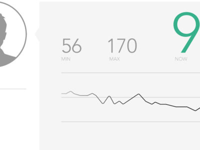
The internet was abuzz last week with the announcement of Apple’s Health app and HealthKit data repository—and the multitude of hardware and software integrations likely to follow (like the one with Cue, a “personal molecular-level testing device, which can give you an instant read on your influenza status). Aside from Health’s mass appeal, the most notable news to us is Apple’s collaboration with big healthcare players like the Mayo Clinic and EPIC. EPIC, the 800-pound gorilla in Electronic Health Records software, began pulling data from popular tracking devices like Fitbit and Withings into its MyChart for patients a few years ago. Still, health information interfaces for both providers and consumers, like EPIC’s, remain clunky and substantially less usable than your typical smartphone app. Apple’s foray into health management represents an opportunity for EPIC to stay at the forefront of the data revolution. It remains to be seen, though, whether a partnership with Apple—known for its focus on brand and an elegant user interface–will influence the day-to-day experience of accessing health data beyond the smartphone.
news
Rumble
The Seattle Design Festival is working to bring together designers and creatives from a variety of disciplines—and engaging them in building inspired, interactive experiences on the “Design Block” in September. Tactile is happy to support the Design Festival this year. Join the frenzied fun on May 16 (make sure to sign up online by May 9) and get ready to rumble.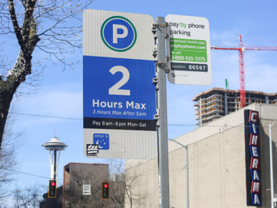
news
Street view Part II
SEEKING A BETTER METER On April 11, the Seattle Department of Transportation will conclude its trial of seven new pay parking stations along Fourth Avenue downtown. In our last post, we pointed out some of the major usability shortfalls in the machines; now we’ll focus on the opportunities that remain in improving the city’s overall experience of parking. The Tactile team spoke with Margo Polley, Project Manager, who outlined SDOT’s priorities in selecting the new meters. They include options for physical retrofits and technology updates; reliable network connectivity; adaptable pay rates for time-based “value pricing”; a full keyboard for pay-by-plate; and faster credit card processing. The seven pay station models selected by the city are now on the street for testing, and one of those models will soon be installed at 12,000 locations throughout Seattle. Unfortunately, SDOT didn’t establish any specific usability criteria or define an optimal pay parking experience. Before budget cuts, Seattle had a more centralized design office that might have overseen a cohesive visual system or user experience mandate. Without that, the city is doing its best to create a better driving and parking experience within city limits. SDOT earnestly wants Seattle to be among the most innovative cities worldwide in terms of parking policy and implementation. Los Angeles and San Francisco, for example, have experimented with chips embedded in busy streets to help adapt the price—and therefore parking inventory—at peak times. Calgary and Pittsburgh are phasing in pay–by–plate systems that reduce waste and enforcer time. It’s hard to innovate, however, with a strained budget, a burdensome bureaucracy and limited hardware options. What’s a forward-thinking (but under–resourced) city to do? In our opinion, Seattle should start by establishing a set of basic usability principles that SDOT can incorporate into future projects: uniform controls, consistent graphics, balanced human factors and intuitive information architecture. Tactile shared our interaction insights with SDOT and we believe even minimal improvements to the trial machines’ interface could make paying for street parking easier and faster. GOING MOBILE On the plus side, Seattle has been exploring a new mobile tech approach to parking. First rolled out in August 2013, PayByPhone is a city service that lets drivers pay for parking via smartphone app or by calling a toll free number. At PayByPhone’s launch, Mayor Mike McGinn commented that, “just by using your phone, it’s now faster and easier to pay for parking in Seattle. We’re deploying technology to make it more convenient for people to visit downtown and our neighborhood business districts.” PayByPhone has already been successfully implemented by other cities including San Francisco, Vancouver, New York, Boston and Miami. So far in Seattle, however, PBP has only seen a 3% adoption rate (about 125,000 parking purchases were made via PayByPhone from August 2013 to April 2014). SDOT and PayByPhone representatives agree that initial marketing campaigns helped jump-start the program, but more word of mouth will be essential for increased adoption. They said that drivers who do use PayByPhone generally prefer it to traditional meters; the biggest barrier is simply lack of awareness. Some of the benefits for drivers include: • Drivers can pay for parking from their car—and add time from a remote location. • The app sends automatic reminders to a user’s phone when parking time is running out. • Motorcycle and scooter owners don’t need to stick pay station receipts to their bike headlights. • Quicker transactions, since the app stores previous payment and license plate information. • Drivers can look up past transactions and print parking receipts online. The city, meanwhile, benefits from better data integration, less wear and tear on physical meters (which means fewer repairs), reduced cash collection and easier adaptation to demand–based pricing. Not to mention the fact that more people add time (and therefore revenue) remotely when they underestimate their parking time and would have previously risked a ticket rather than making a second trip to the meter. From a user experience standpoint, the PayByPhone app can also be updated regularly, allowing for new features and fixes. There are a couple of drawbacks: PayByPhone users pay a thirty–five cent convenience fee for each parking transaction. And calling PayByPhone from a non–smartphone doesn’t really save much time over using a physical pay station (unless coins are the alternative). But for smartphone–carrying, tech–loving, efficiency–craving drivers—particularly those who park in South Lake Union, downtown and Capitol Hill—PayByPhone is a boon. So how can Seattle increase adoption to take advantage of a technology that seems to be effective and user–friendly? Try some incentives: Waive the convenience fee or discount parking for residents, as Miami has done. Or put energy into a viral promotional campaign that incentivizes Seattle drivers and visitors to download the PayByPhone app before they’re even near a meter. More usage means better parking data and more revenue for the city—and a better user experience for drivers who just don’t want to deal with confusing meters. SDOT’s Parking Pay Station Trial ends on April 15 (you can take the survey at seattle.gov/transportation/parking/newpaystations). We hope the city will learn from user feedback and make usability tweaks to both the new station interface and any future systems. If the cloud in replacing 12,000 parking meters is choosing among models that are decidedly more reliable but only slightly more user–friendly, then PayByPhone might just be the silver lining.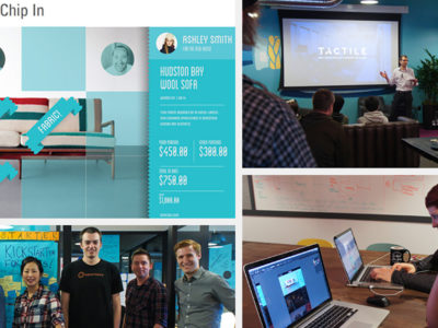
news
Starting Up
Can you really build a business in 54 hours? Maybe not—but you can certainly have fun trying. Tactile took part in Startup Weekend: Redesign Seattle at WeWork this weekend, contributing speakers on design thinking, a coach, and two designers who brought the winning team (Giftstarter) across the finish line. Our collaboration was part of Startup Weekend’s effort to bring design more squarely into the ideation process. It’s clear to everyone involved that the teams with the most visually clear and compelling pitch presentations go farther. To us, though, the real opportunity is helping every member of every team understand what’s at the core of great product design: Creating a truly fantastic customer experience. We look forward to rolling up our sleeves for the next experience design-intensive Startup Weekend.
news
Titanfall
Titanfall has landed. We’re excited to play the most–anticipated game of the year—and to pick up the limited edition Titanfall Xbox controller. Tactile has been a long–time collaborator with Xbox, and this project let us peek behind the curtain during the development and launch of Titanfall and work directly with both Respawn Entertainment (the game developer) and Xbox’s internal industrial design team. Tactile Design Director Rich Hanks commented, “It’s great to design for such an enthusiastic user. Every detail is meaningful to the core gamer, so authenticity is key. The result has to have a ‘wow’ factor—something that will inspire someone to save up and wait in line the day it hits the shelves. We had to create a must have product for the Titanfall fan.” For this fast–paced graphics project, the Tactile team immersed itself in the world of Titanfall. The controller, like the game, has a future military feel, with direct references to one of the game weapons that is sure to be a player favorite. Our team’s challenge was preserving the integrity of the Xbox brand language while integrating the excitement the game offers. This meant incredible focus on detail, down to constant iteration on the perfect shade of Militia orange. With each limited edition Xbox controller we touch—Tactile collaborated on the Tomb Raider version in 2013—we learn new production processes and build experience we can bring to clients across other industries. We also love working with the Xbox ID team for their consistently high standards of quality and execution. It’s a great fit for the Tactile team, too, which is uniquely suited to intense CMF (color, material, finish) efforts that require high–level graphic attunement. It doesn’t hurt, either, that we have deep experience with Xbox gamer culture. Xbox is quickly becoming the center of entertainment for families. For us, limited edition controllers present a unique chance to design for serious gamers while making sure the result is accessible for every player. Working on graphics for the Titanfall controller is just one great experience in a long history of collaboration with the Xbox team. They are as passionate as we are about details, and we can’t wait to see what’s next.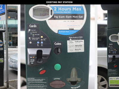
news
STREETVIEW PART I
Stuck card, connection failure, redundant charges—nearly every Seattle driver has had a frustrating experience with a parking pay station, including everyone on the Tactile team. So when the Seattle Department of Transportation (SDOT) announced their plan to replace 2,200 parking meters over the next two years, we took note. Then, when they installed seven trial pay stations along Fourth Avenue—literally in our front yard—with a request for public feedback, we got excited. We wanted to understand why Seattle is investing in a parking meter overhaul in the first place. According to Project Lead Margo Polley, SDOT purchased a few rounds of pay stations over the last decade that simply haven’t held up to network demands and necessary upgrades. The city definitely feels some buyer’s remorse. While some of the meters appear new, most are more than eight years old and no longer connect reliably to process payments (thanks to outdated modems and low-bandwidth networks). SDOT had to beg the city council for $450,000 in 2013 for an urgent modem patch, and they’re trying to avoid sinking more city dollars into technology that will quickly become obsolete. Now they’re searching for a pay station that will not only meet the city’s basic needs, but also hold up for at least a decade. The Tactile team designs tools that are both functional and attractive, with a heavy focus on creating a fluid, intuitive user experience. This applies to medical devices, professional–grade oscilloscopes, video game controllers and daily–use products not unlike our city parking meters. While constraints vary from project to project, the same principles of simplicity, ergonomics and intuitiveness apply across the board. Armed with these principles, we headed downstairs to Fourth Avenue to get to know the seven proposed pay stations. On first glance, it was clear that SDOT was attempting to offer drivers more options, but we felt that most of the seven prototypes missed the mark in terms of usability. Issues we observed included: • Feature creep—in trying to add a QWERTY keyboard, more time options and shortcuts, all of the pay stations ended up feeling cluttered. As a result, the primary function got lost and users ended up feeling overwhelmed. • Inconsistent visual language—most of the pay stations had a mess of colors, button shapes and stickers, all of which created confusion. Icons seemed arbitrary, too, with no symbols in common with other Seattle signage. • Weak information architecture—aside from hard–to–read type both on–screen and on the buttons (forget trying to read them at night), one of the biggest challenges we saw was a lack of visual organization and interaction flow. None of the pay stations presented a bold, simple set of 1–2–3 instructions for selecting time and payment that felt intuitive. There were extraneous buttons in strange places, or arrows pointing to other buttons that suggested reading more instructions on-screen—not exactly a clear and quick directive. • Poor haptics—though it might seem like a minor detail, more responsive buttons would help assure the user that their selections have registered correctly. A “solid” button feel and tactile feedback could mean the difference between an error–free ticket purchase and accidental overpayment. Of course it’s easy to see what isn’t working. Next, we want to learn more about the physical constraints, supplier options and necessary features that are driving the new pay station prototypes, and offer some constructive feedback. We love contributing to the conversation about something so close to home—and the “user experience” of a city we’re passionate about.
news
CONVERSATIONS
We’re thrilled to co–present this panel discussion with our friends at MakerHaus, exploring the evolution of design as a discipline–and the new media we are integrating each day. Register now; tickets (and refreshments) are free but seating is limited!
news
BRAND EVOLUTION
When it came to designing the new Tactile logo, we sought a fresh perspective from our friends Don and Ryan of Invisible Creature. We came to them with some high–level ideas that we thought reflected our culture well, and they lent a refined eye and a touch of the unexpected. It was a great collaboration with a talented local design agency. It goes without saying that it’s tough to finalize your new logo—but the guys at IC made it feel easy.