Genie Visual
Brand Language
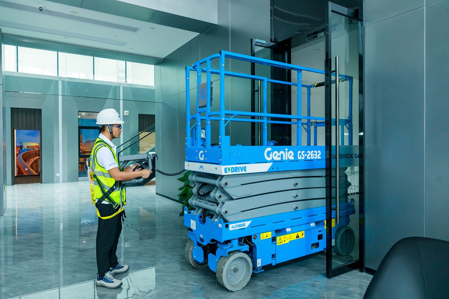
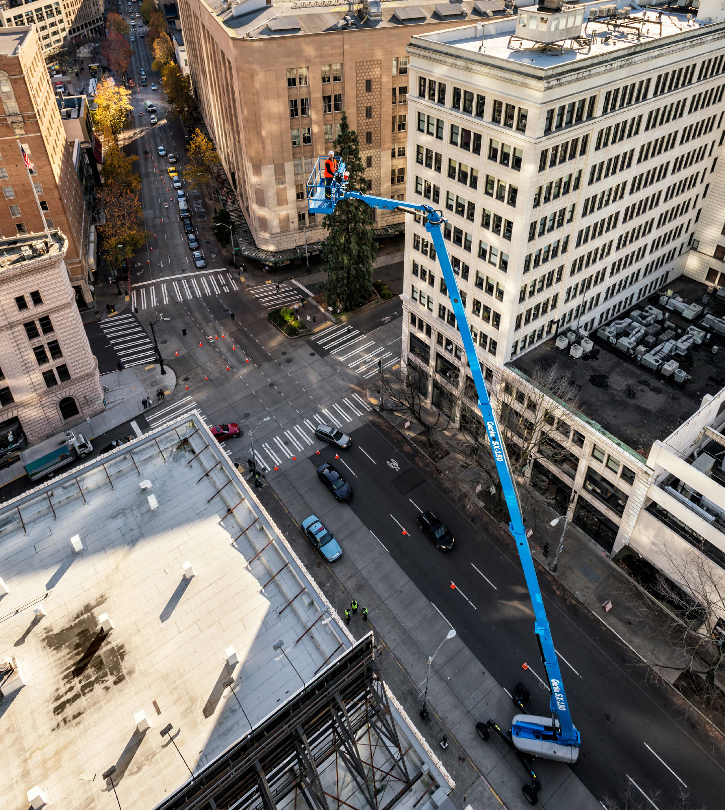
Genie manufactures lifts and platforms used in construction, maintenance, warehouse stocking, and equipment installation. They produce machines that set the industry standard for quality, reliability, and safety; those values are the cornerstones of Genie’s brand legacy.
To elevate and bring consistency to the brand, Tactile updated the visual language on all their lifts, considering everything from housing form factor and graphics to overall color of the machine. The Genie Visual Brand Language is a 2017 IDEA Award Finalist (Design Strategy).
Color Story
We wanted to tell the story of reliability and safety that is integral to the DNA of Genie’s product family. Trust is critical for professionals who spend their workday in a lift high above the ground; that trust is the legacy of the brand.
Our goal was to modernize the look and feel of Genie products with timeless designs. The new machines needed to look even more capable and trustworthy than the last Genie product they used.
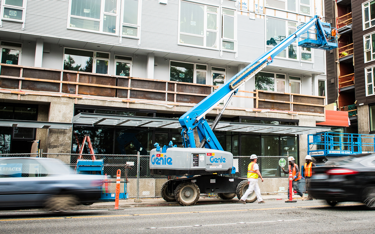
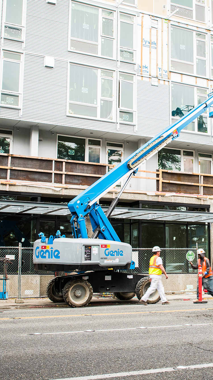
For the first time, black—not
blue—is now the standard color
of each machine’s base.
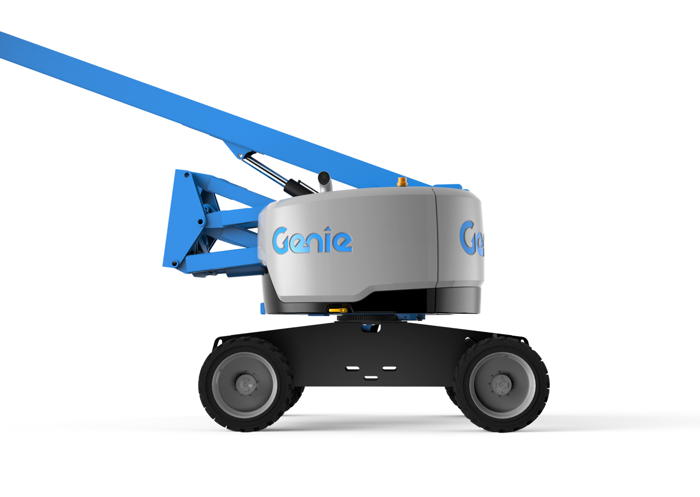
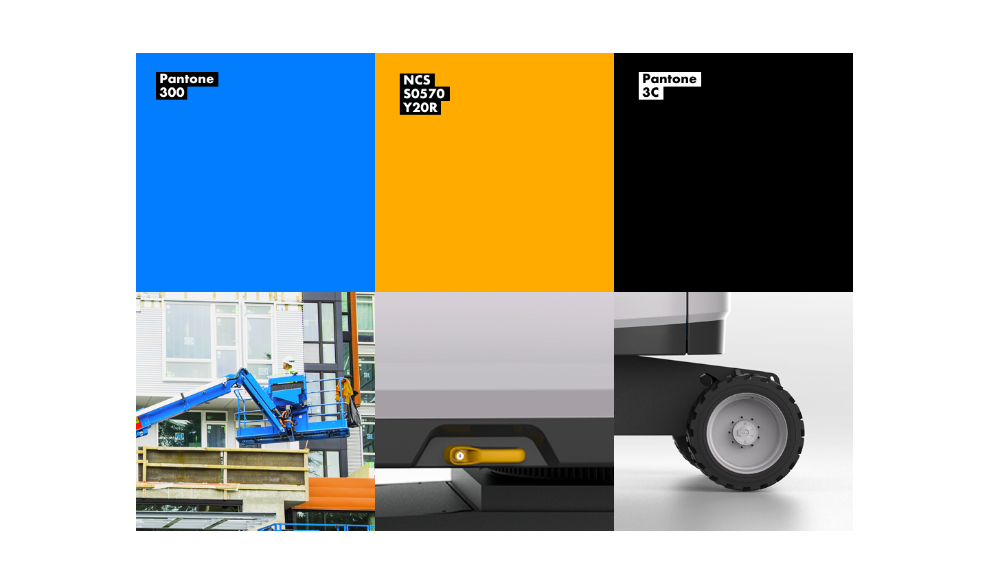
The new visual brand language represented a major aesthetic shift. For the first time, black—not blue—is now the standard color of each machine’s base. Blue is Genie’s signature brand color, and to strategically protect their legacy, it meant removing the blue color from the area that receives the most wear, the base. By incorporating blue in more strategic, intentional areas, it would become more prominent.
Black—as opposed to another color, like grey or white—was important for the base, because it shows dirt less and can be easily touched up or repainted. It also gives the appearance of a sturdy, solid foundation. It was important to connect the appearance of the machines to the overall product story for the company. We kept blue on the logo and the arm to reinforce the brand and symbolize the Genie mantra: Blue is the color that lifts.
"Blue is the color that lifts."
Field Research
We traveled the country with Genie salespeople and met with customers in the field, on job sites, and at equipment rental yards. We returned to Seattle with a story and a concept.
The customers value safety and efficiency over early adoption of the newest products, so our design had to reflect those essential values.
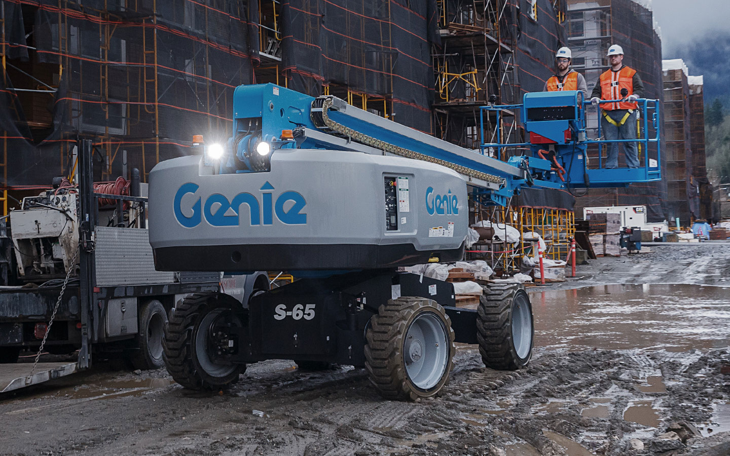
A Universal Approach
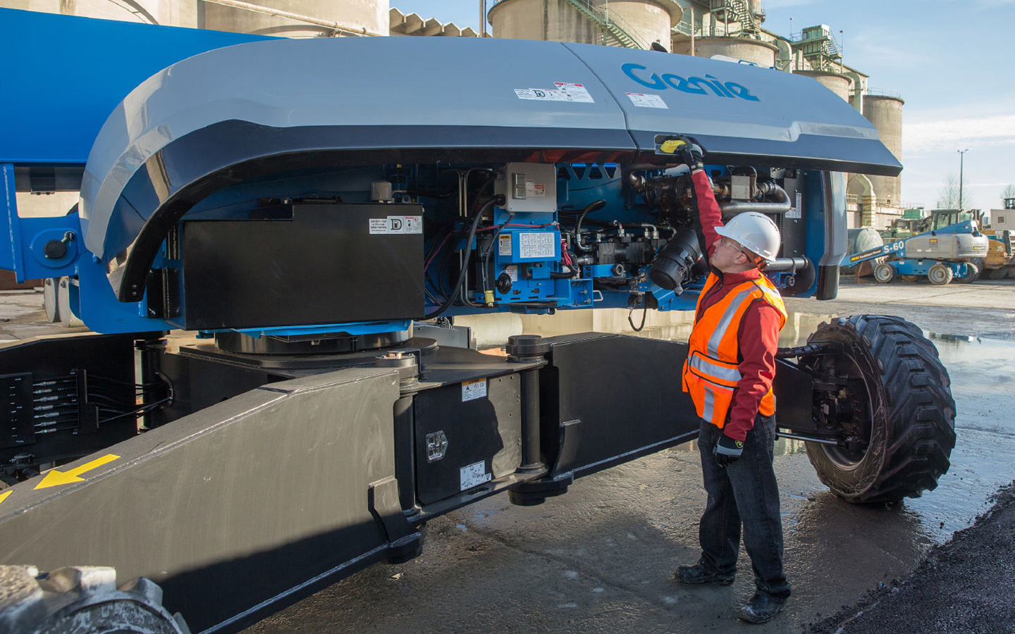
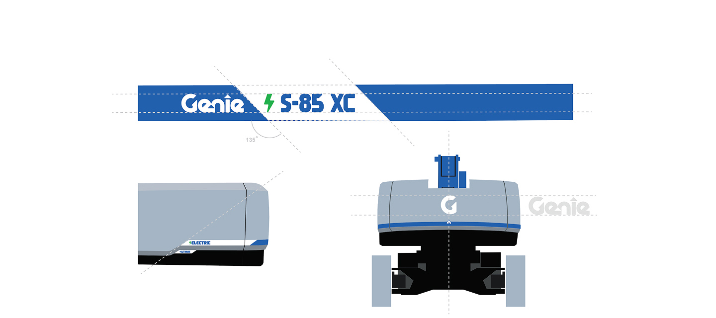
The biggest challenge was to create designs universal enough to accommodate all the internal components, regardless of the variations in engine type and configurations.
We needed to develop a visual identity that could be applied to multiple variations of products and still be recognizable from 20 feet away. And it has to look fresh and new for longer.
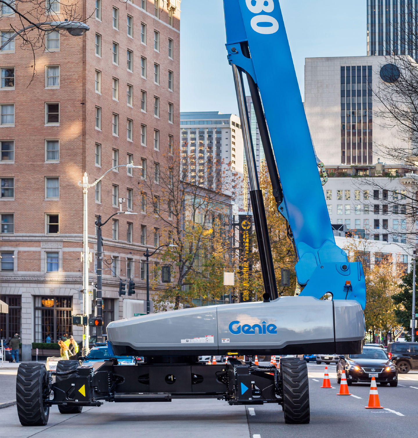
An Electrified Future
Driven by a steadfast commitment to sustainability, Genie has introduced electric and hybrid versions of its flagship lifts, answering the industry’s call for greener, more efficient equipment. As Genie’s product portfolio evolved, we collaborated closely with Genie to thoughtfully extend their visual brand language across these innovative new models. We developed unique design cues to instantly identify
electric and hybrid offerings, ensuring they stand out in the field while staying true to Genie’s trusted legacy. This strategic evolution not only differentiates the next generation of Genie equipment, but also signals the company’s leadership in advancing safe, reliable, and eco-conscious solutions for the job sites of tomorrow.
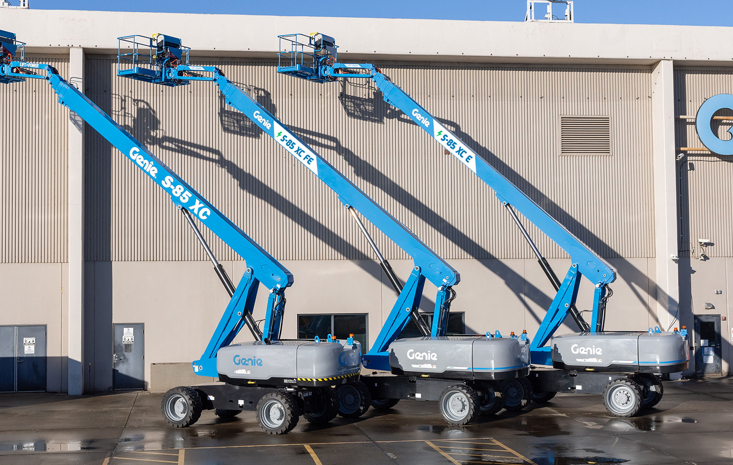
Distinguished Features
The electric versions of products need to stand out from their gas powered counterparts. Split graphics communicate the bolt of electricity and provide visibility from across the job site. The introduction of a white logo further cements the theme that Genie is a premium brand looking ahead to a modernized
future. To consistently apply these changes, we developed brand guidelines that illustrate the updates in a universal way. These guidelines serve as an important asset when adapting current products and designing future generations.
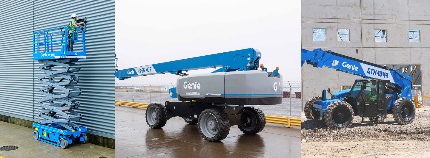
Unified Graphics
The diversity of products within the company meant developing a system than could be applied to everything from compact Slab Scissors to
All-Terrain Telehandlers.
We leveraged our knowledge of developing the rest of the system to ensure designs were scalable, and did not bias a particular product category.