Milwaukee
Rotary Laser Level
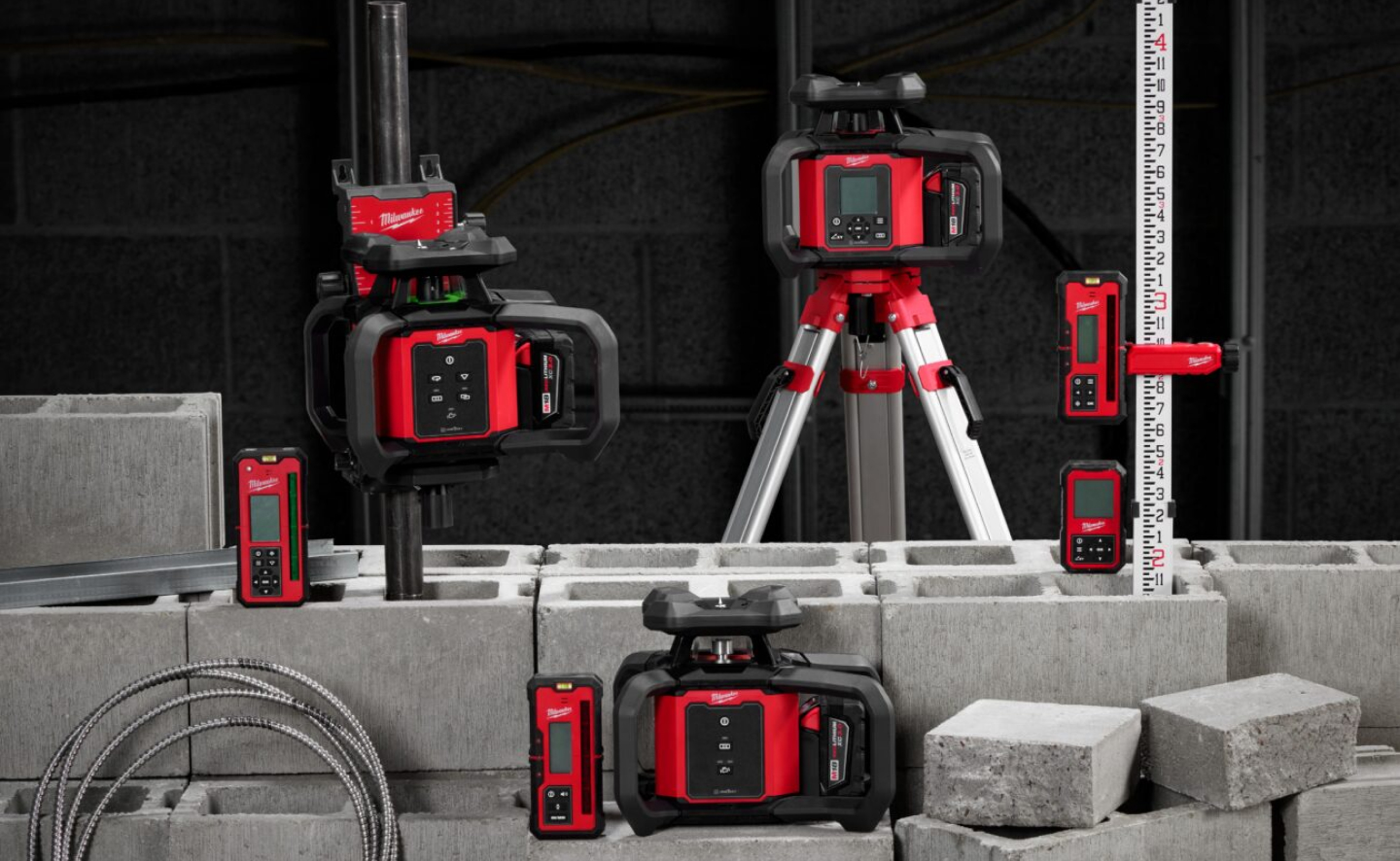
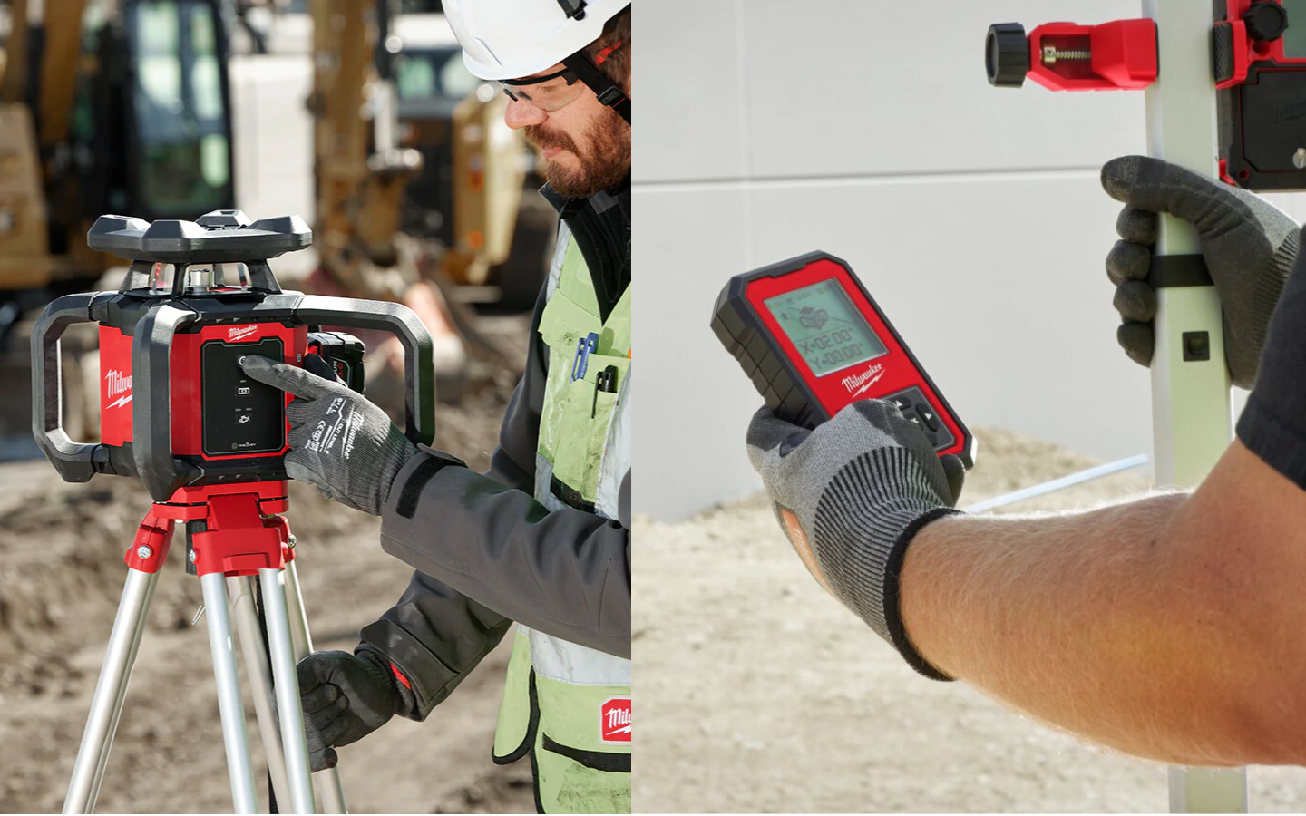
Milwaukee partnered with Tactile to help create a first-in-class user experience for their rotary laser level line. These precision digital products represent the next generation of digital measurement, improving critical site data accuracy. The challenge was to make these highly technical products as approachable and trustworthy as a conventional level. The solution was designed to scale between multiple product types, use cases, and languages.
We explored behaviors to conserve battery life when appropriate, animations to help guide users, and audio cues that were clear enough to cut through job site noise. Screen and physical button interfaces were codeveloped with Milwaukee to be easy to read in direct sunlight while still communicating the trustworthiness of the Milwaukee brand. The Milwaukee Rotary Laser Level is a winner of a 2024 IDEA Silver Award.

Hands-on
Learning
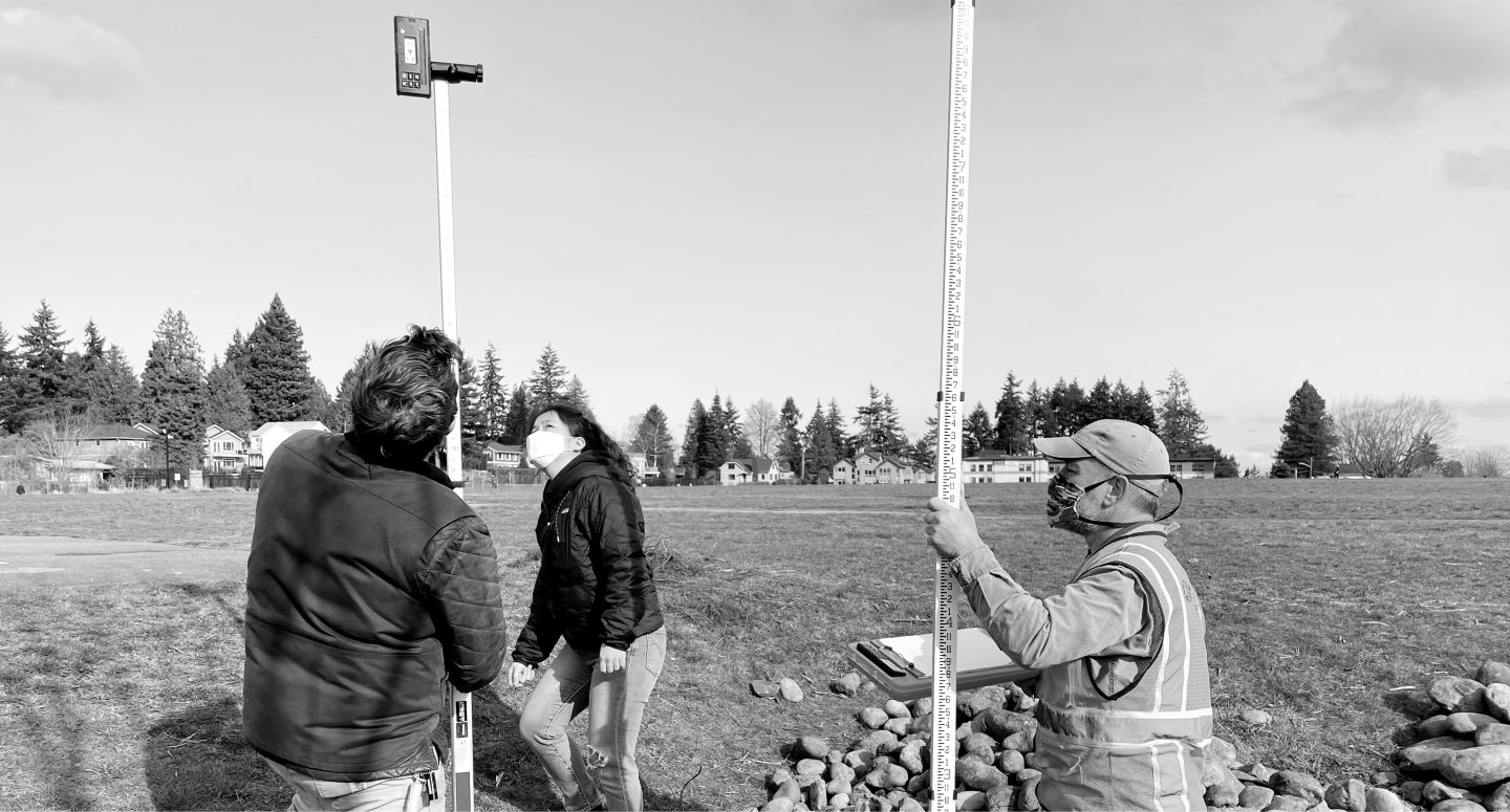
Our team went into the field to learn from professionals that use these tools daily, documenting the steps required to survey and measure a site. By walking through these processes, we found numerous moments of confusion, complication and opportunities for improvement.
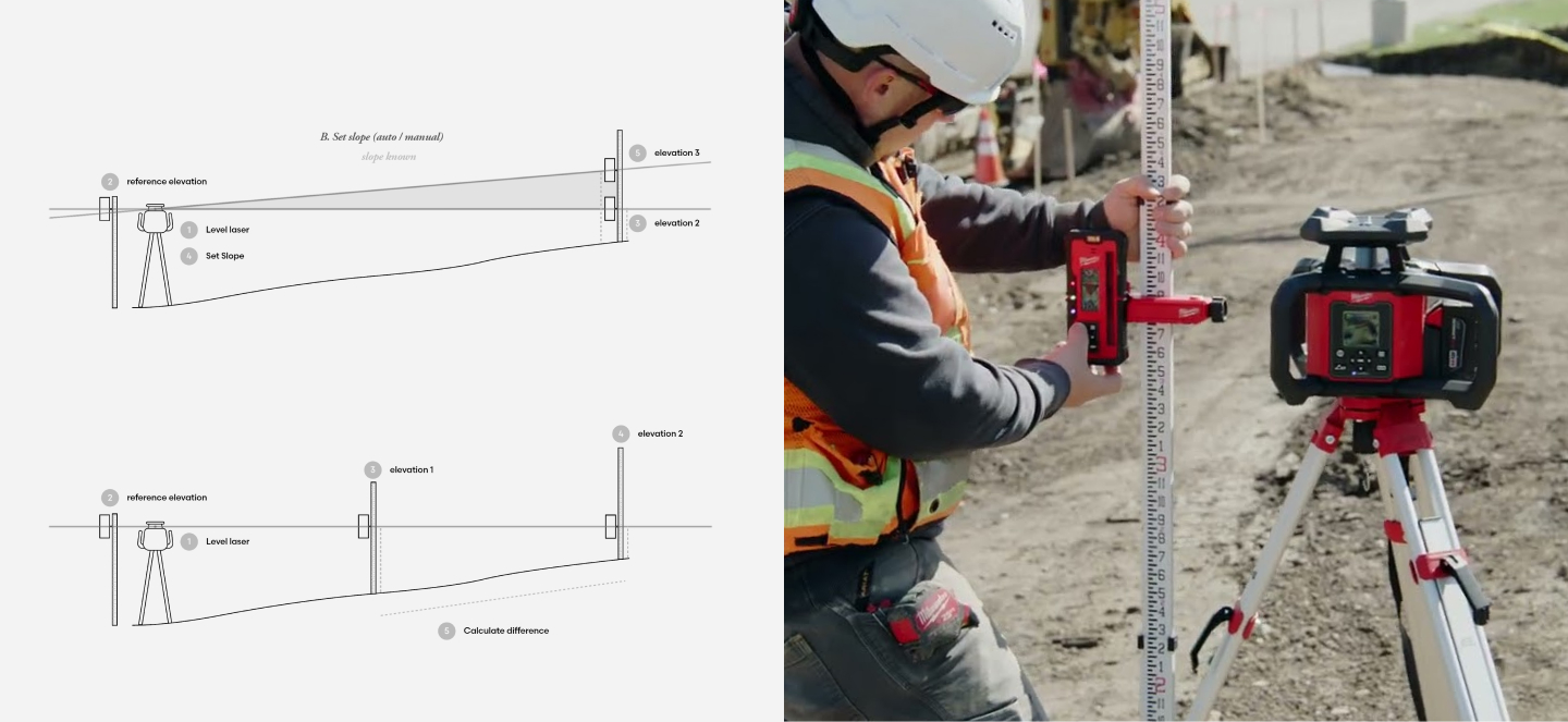

Simplified Site Layout
Laser levels are commonly used to measure slope and elevation on a site, setting the stage for other trades to locate and build according to these guidelines. These measurements are critical to ensure accuracy, reduce rework, and keep projects on time and on budget.
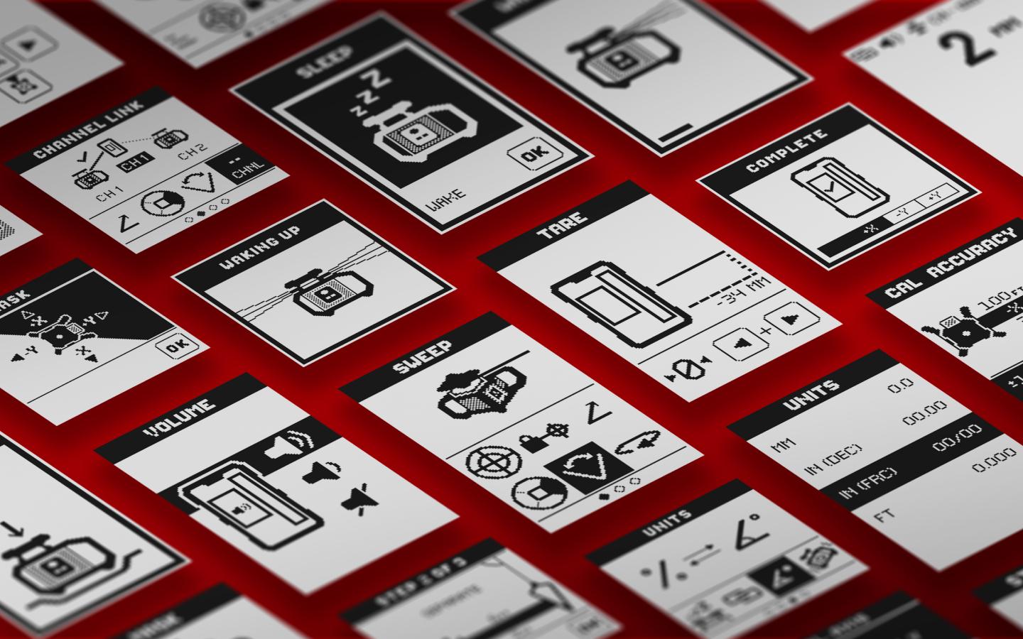
Our team incorporated easy-to-understand graphics and step-by-step instructions that help guide the user through an accurate measurement. Additionally, we worked to specify screens, sounds, and lighting that could quickly and easily be read in bright, sunlit areas.
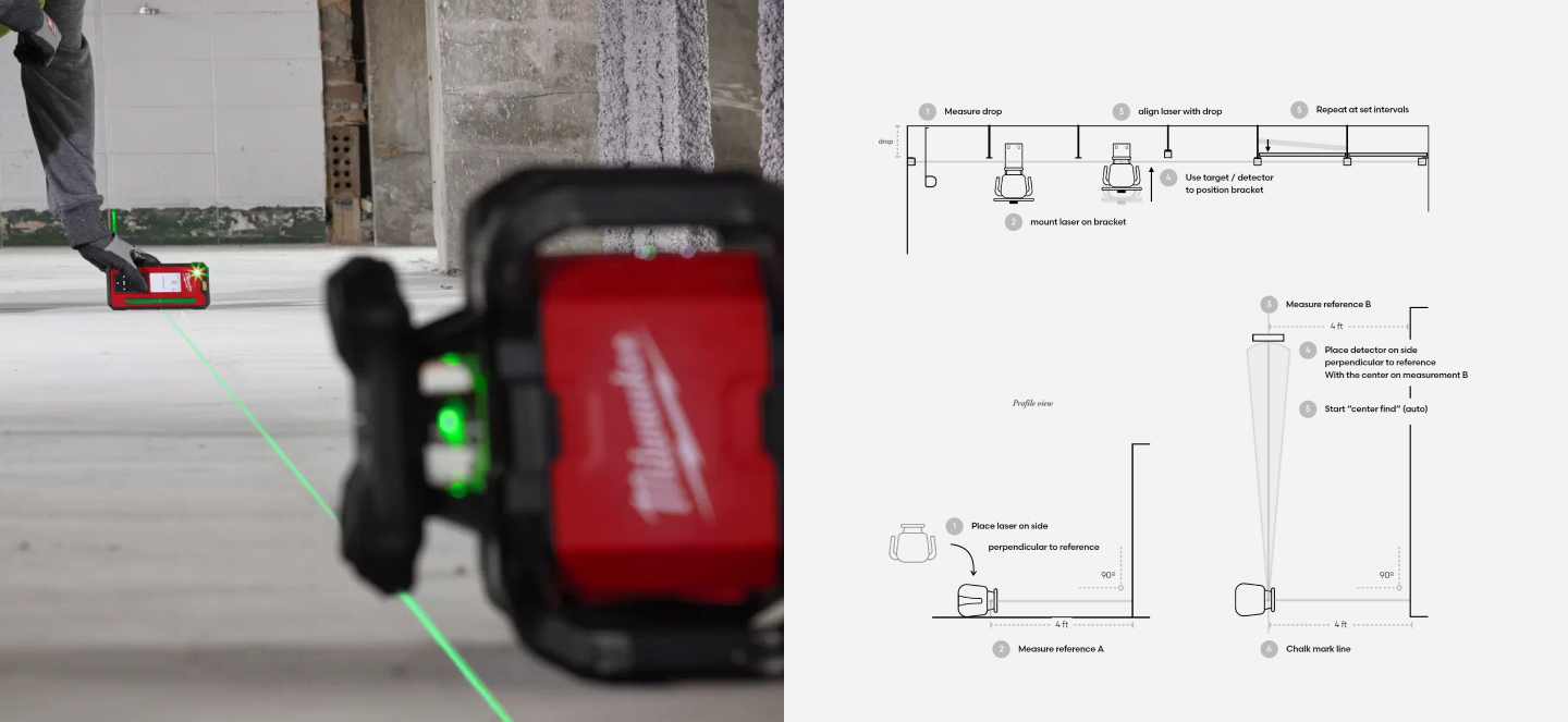

More Accurate Interiors
Once a structure is built, rotary laser levels help construction workers accurately place vertical walls, horizontal ceilings, and other interior elements.
This process can be time-consuming and confusing, so to help users navigate the task, we shifted the hierarchy of menus and icons to allow someone to quickly and intuitively learn how to set the device to make these kinds of measurements.
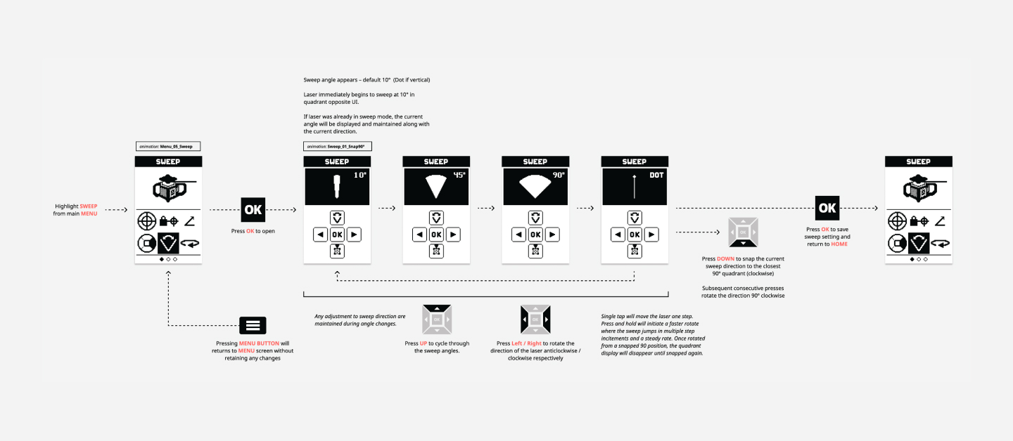

Refined Workflows
As development continued, we increased the fidelity and detail of our UX diagrams to illustrate how the devices would react to input for many specific tasks.
These example flows were iteratively developed, allowing multiple rounds of refinement to try out new ideas and reduce confusion for a user.
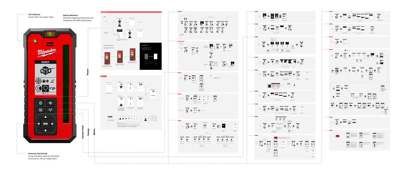

Integrated Design System
Once each workflow was adequately refined, Tactile merged them into a cohesive user interface that behaved predictably and maintained continuity between different devices. This included devices with screens and others without, so driving consistency between them was critical.
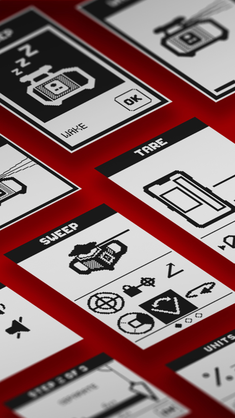
This effort included creating a library of standardized iconography and graphically illustrating how the user would move from one subsection to another with extensive UI flow diagrams.

Scalable Solutions
Tactile created a system that is capable of working across many devices in the Milwaukee line of products. Solutions were geared to provide flexible applications to different screen sizes, iconography with minimal text to help bridge language barriers, and user interactions that could be extended into new workflows that have yet to be defined.
By gaining empathy for users in the field, addressing their challenges, and allowing those insights to drive a larger design system, these solutions will simplify future product development while maintaining the trustworthiness that the Milwaukee brand has come to represent in the construction industry.
