Starbucks
Professional
Design System
At the heart of the Starbucks café experience are their employees–an essential factor in delivering the perfect treat to customers. No minor feat, given the wide array of choices available. So, to help streamline the beverage-building process, Starbucks asked Tactile to craft a common UX strategy and UI design system for all their connected behind-the-counter equipment, now and into the future.
Tactile’s hands-on experience and direct working knowledge of Starbucks’ device ecosystem left us well-positioned to take on such a challenge. The resulting design system helped Starbucks realize more intuitive, enjoyable, and effective devices that balance the needs of both employee and customer. All this was done in an effort to continually deliver a better, more cohesive Starbucks experience.
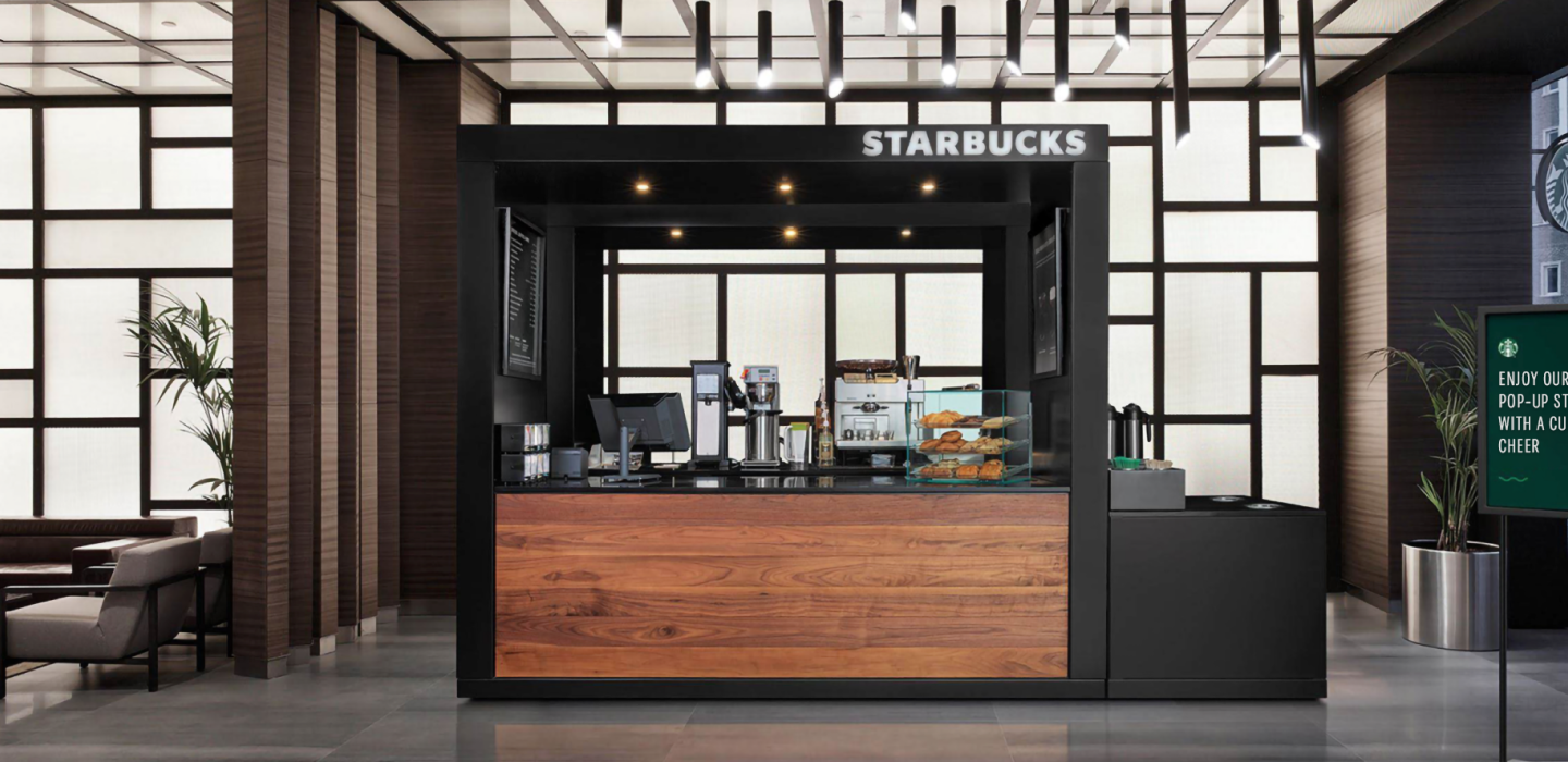

Unifying the Starbucks Ecosystem
Starbucks employees (also known internally as “partners”) rely heavily on their trusted tools to craft thousands of delicious beverages per day. This load capacity emphasizes the need for a seamless and efficient work experience, one supported by equipment that’s immediately recognizable and easy to use across all locations.
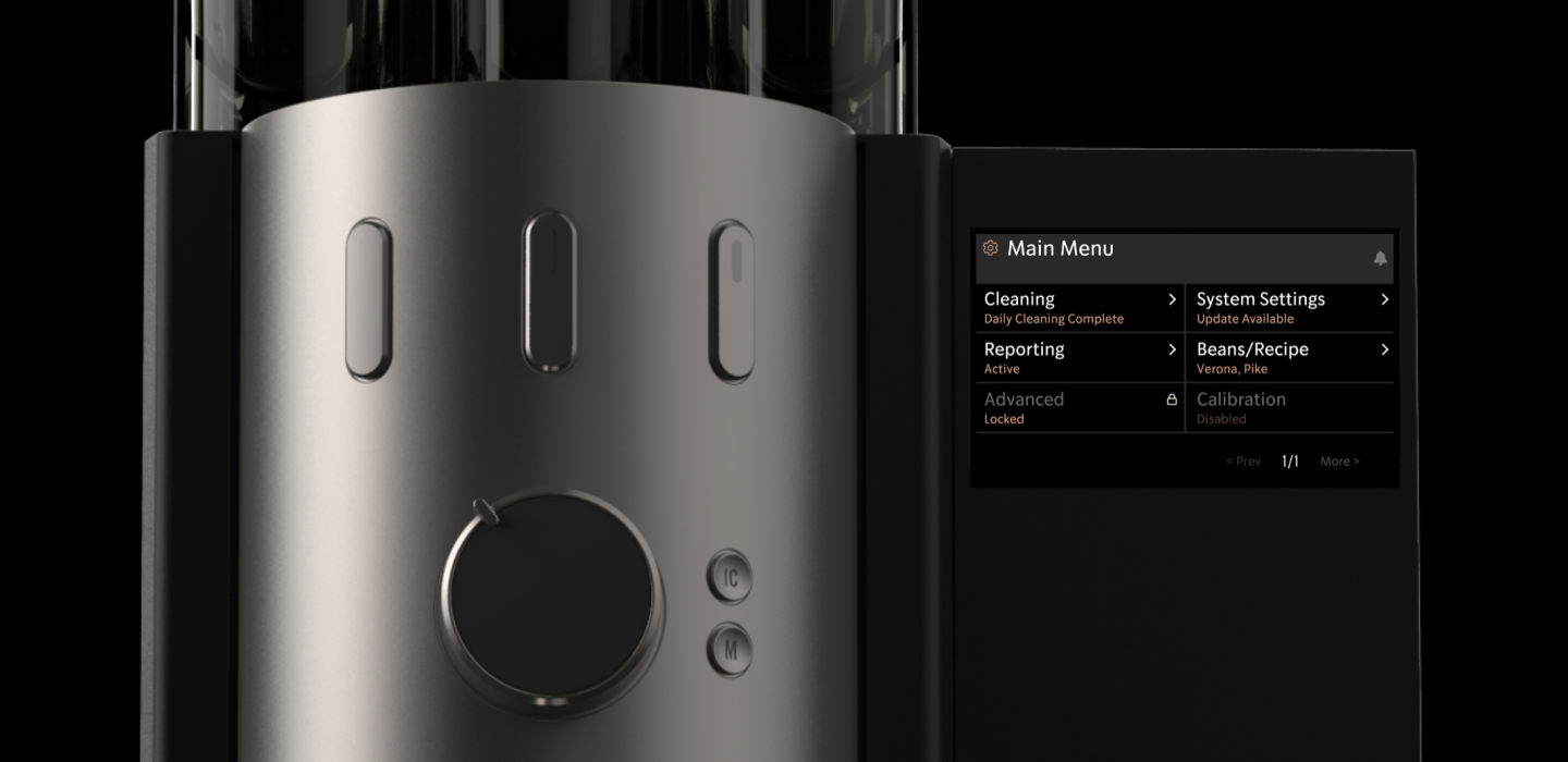
The resulting Starbucks Professional Design System is crafted from a foundation of highly functional interactive components and visually intuitive patterns. This system helps Starbucks and their partners realize a more accessible, enjoyable, and effective device experience.
Our Approach
To develop this unified vision for current and future connected devices, we began by establishing a strong foundation of knowledge. Tactile interviewed stakeholder groups from across the Starbucks business in order to establish a core set of guiding UX principles prior to establishing the foundational UI patterns that make up the system.
In the end was a newly defined design language that was integrated into the product development process. Our work with Starbucks elevated the quality and consistency of Starbucks device UI in order to create a more cohesive family of equipment. It is a system intended to be more modular, flexible, and scalable across different users and types of equipment, now and into the future.
Phase 1
Insight Driven Research
16 stakeholders, 11 teams
Each interview was conducted as a virtual one-on-one that covered questions from current design and development processes to existing and upcoming equipment, and in-store experiences.
The goal of these interviews was to gain an understanding of the current device landscape and processes, as well as gather any intel on current needs, desires, and areas of opportunity.


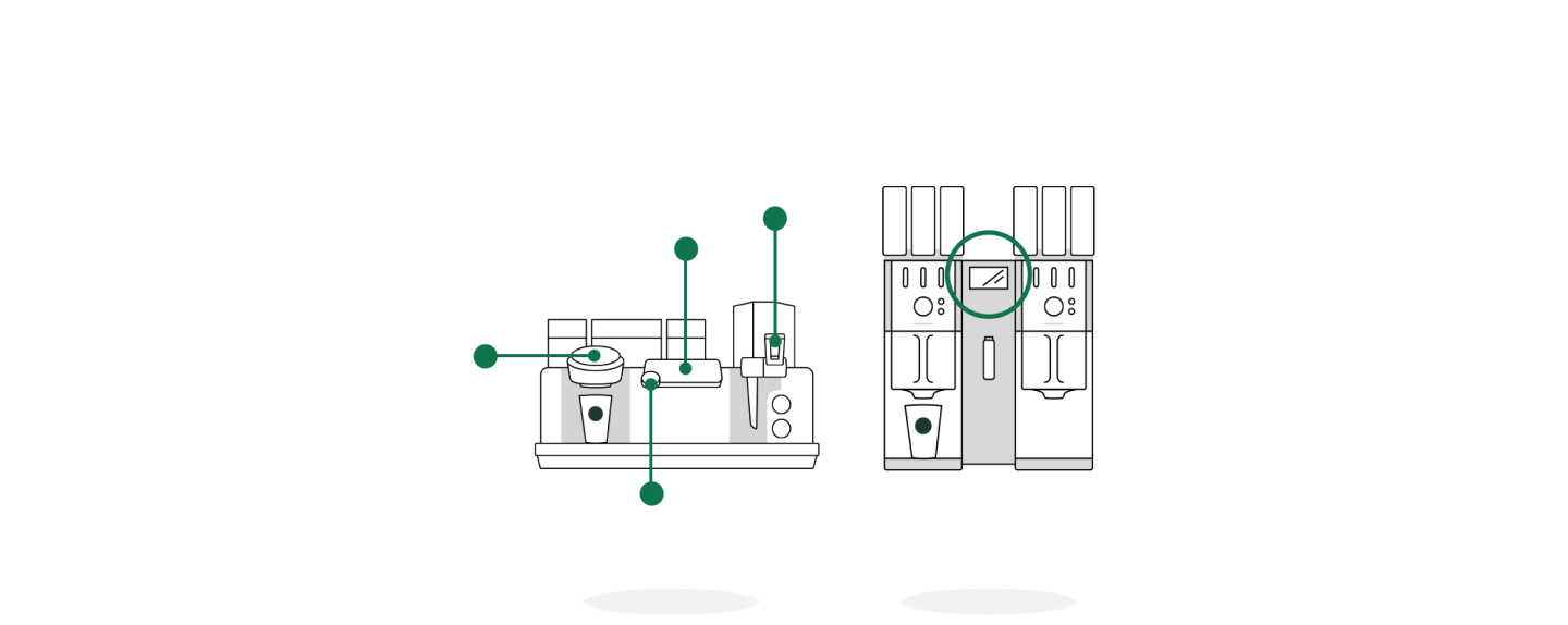

Once the interviews were complete, we evaluated the feedback to identify common themes. These insights highlighted strengths and challenges associated with current and past Starbucks equipment. At the same time it helped to establish a clear set of priorities and opportunities, bringing focus to our ongoing design work.
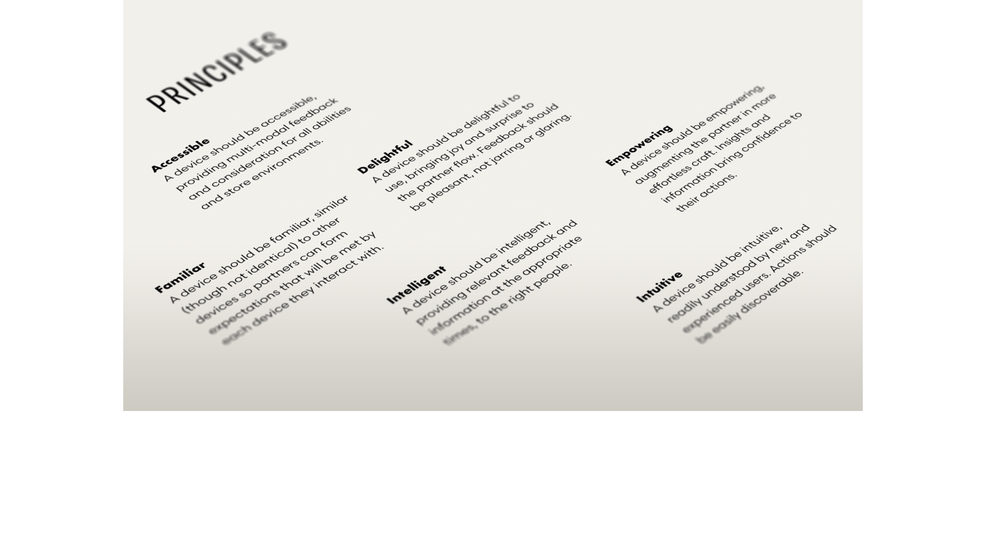
The themes were distilled into six essential design principles. The intention being to guide decision-making, while also defining the experience for key product features and functionality. This helped the system strike the right balance between business goals, in-store partner experience, and customer convenience.


Phase 2
Device Audit and Deep Dive
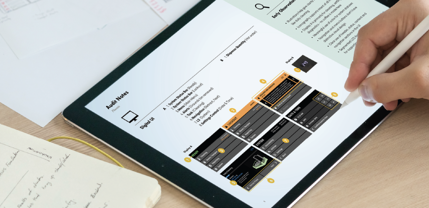
In this auditing phase, we took a closer look at current and past equipment. Evaluating the various UX/UI implementations, we gained a clearer understanding of existing features, patterns, and functions.
Using our six design principles as a guide, we audited device experiences to identify areas of alignment and opportunities for improvement. This work would steer our path forward for the new design system.


Phase 3
Building Common UX Patterns
Leveraging the findings from the research and audit phases, we began design exploration for a prioritized set of foundational UX components and UI patterns. These would act as a basis for all devices, drawing on common features and functionality within the ecosystem.
We started with device agnostic wireframes that described basic pattern behaviors for common features like alerts and sequenced tasks. Each pattern was documented in a living file that was incrementally updated and refined as we moved ahead into the validation phase.
Phase 4
Validation + Refinement
Using Tactile’s ongoing device development projects, we were able to begin implementing and experimenting with the core UX patterns. Through this process, we gained valuable learnings in an effort to optimize the experience and validate solutions before moving forward with design refinement. This is where the Starbucks Pro Design System really began to take shape–by intentionally crafting unity between the brand, their apps, and all the connected devices that baristas use every day.
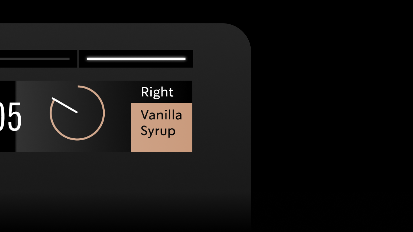
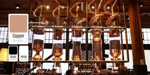
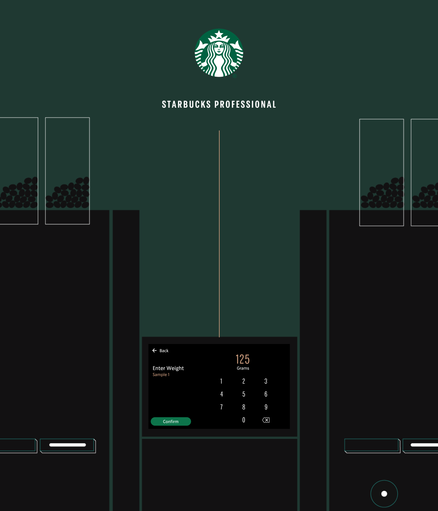
While approaching visual design for the system, we employed a minimal color strategy of black and white plus copper accentuations. The simple use of the copper color gives all baristas a sense of craft pride by referencing physical materials seen in the higher-end Starbucks Reserve stores.
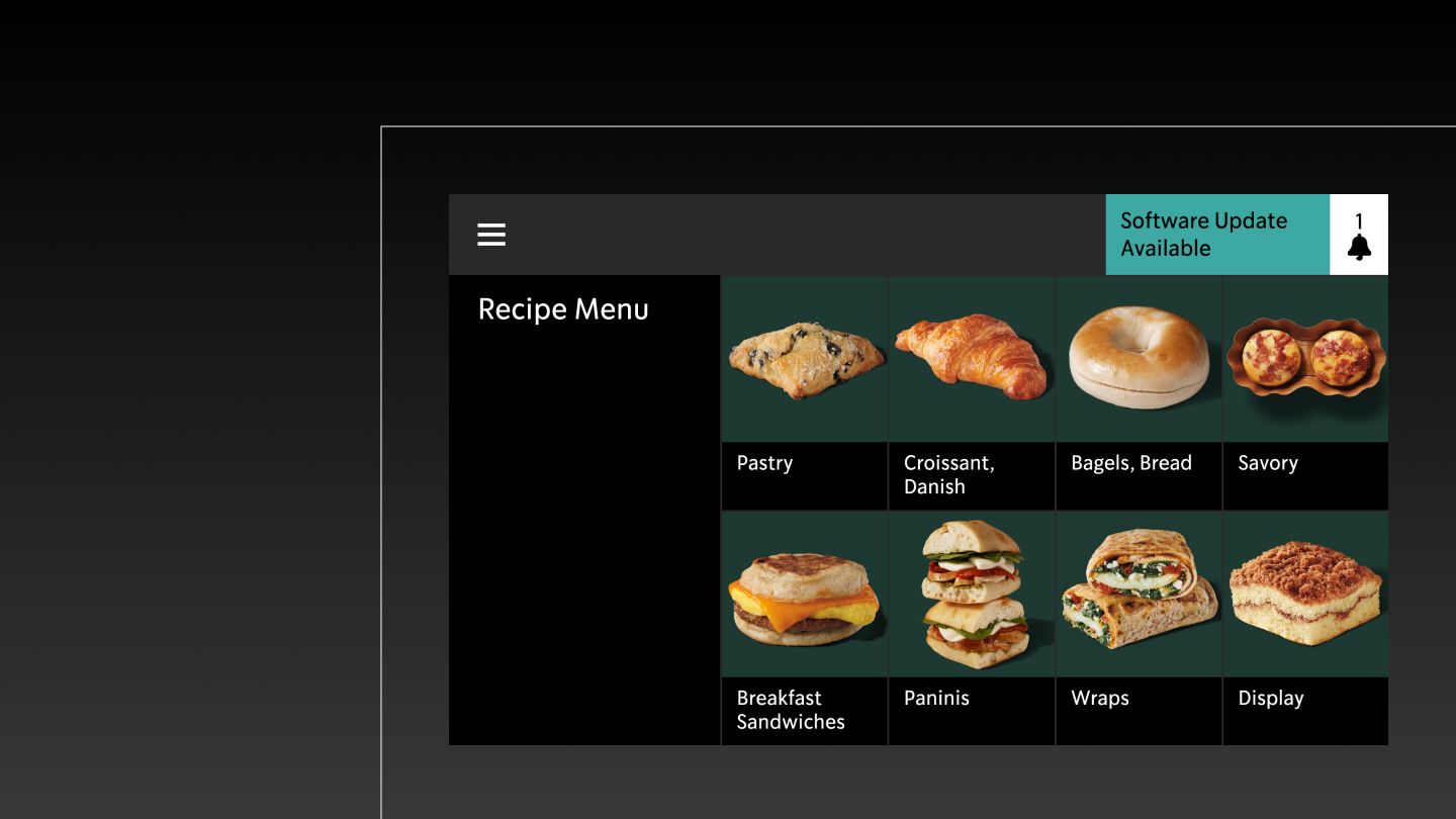
These were just some of the elements that helped elevate important information without distracting customers or disrupting partner attention. Other aspects included high contrast text (adhering to strict accessibility guidelines), clear iconography, and simple, intentional typography. All of which came together to create a better informational hierarchy that’s easy to read and understand. And always foundational to the process was the ability to build with enough flexibility to scale across a wide range of device types and sizes.

Phase 5
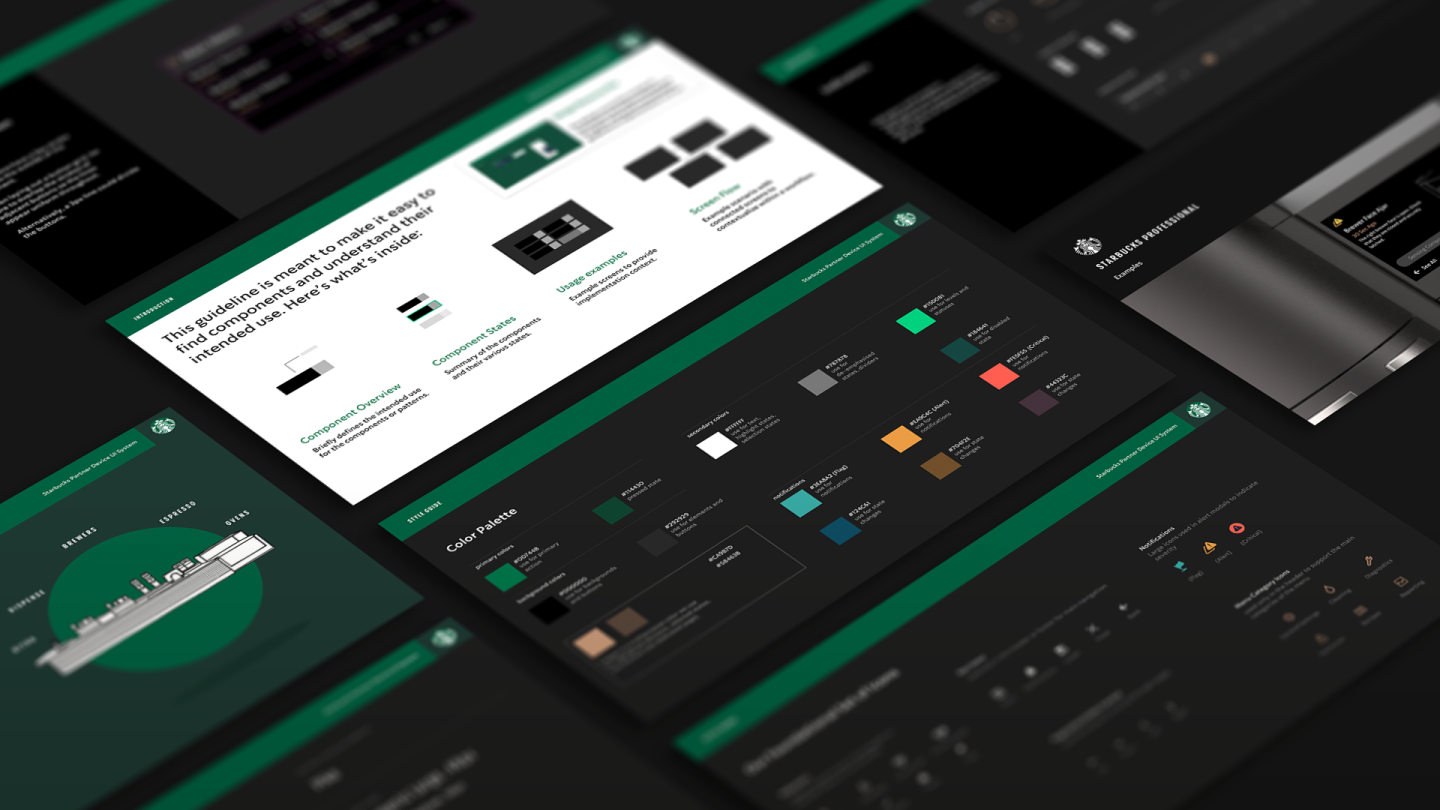
Finalization + System Guidelines
Tactile worked closely with a variety of Starbucks stakeholder groups, over the span of a year, to deliver a holistic and intuitive design language for all of their connected equipment. The resulting Starbucks Pro Design System improves device usability by reducing steps and streamlining the engagement experience for partners. It also helps optimize the Starbucks product development process. Our work with Starbucks helps pave the way for a more coherent and connected equipment future.
