
Starbucks
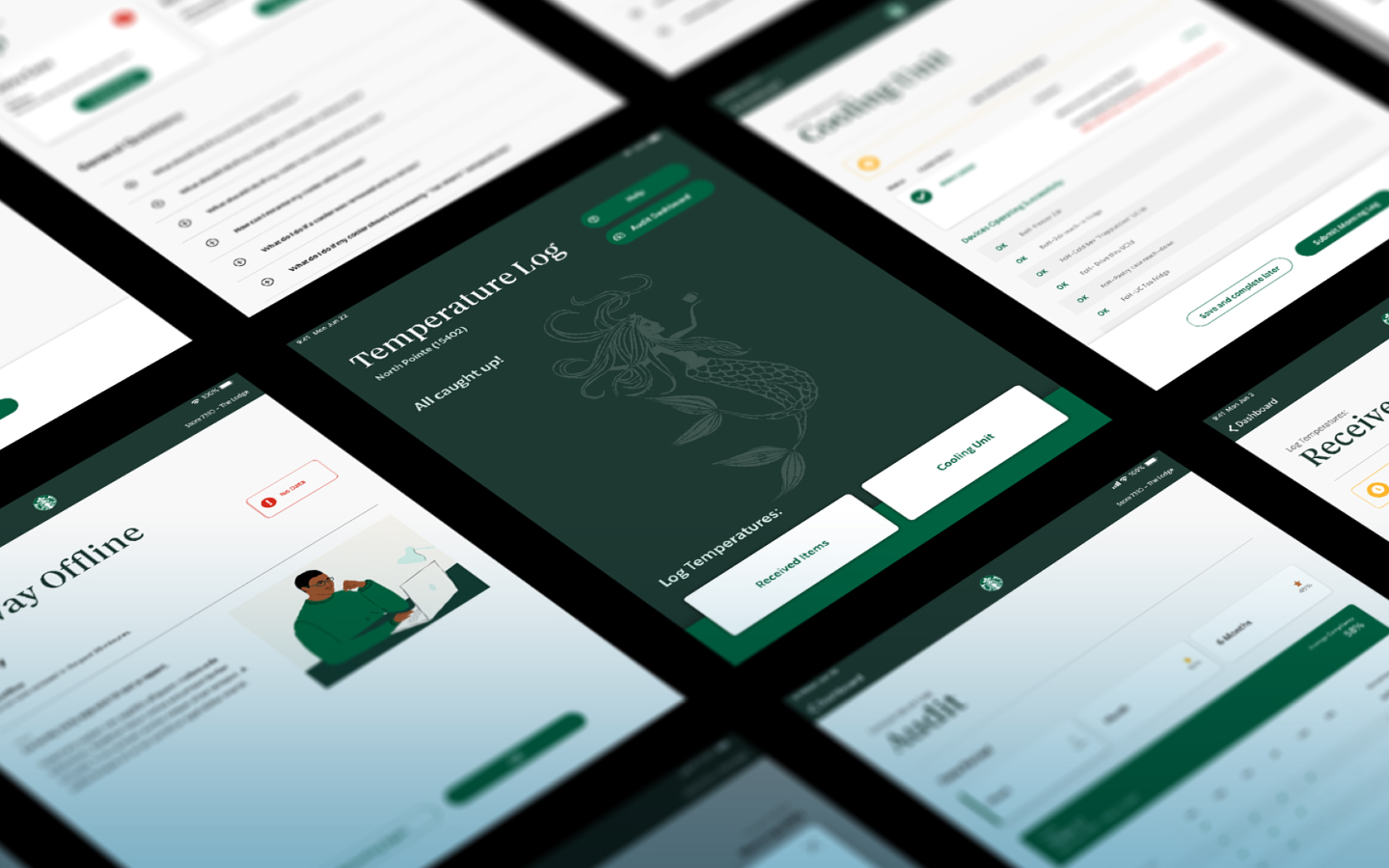
Temperature Sensing
Tablet App
Starbucks is constantly looking for ways to improve experiences for not only their customers but also their employees (or as they call them, store “partners”). In this pursuit, they have embraced internet-of-things (IoT) technology to send real-time store data to the cloud in order to deliver even better experiences. This Temperature Sensing project utilized the Starbucks cloud to improve on-the-ground procedures and maintenance, saving both time and money.
The goal of this project was simple and practical: Improve the way partners check and log fridge temperatures across stores through an easy-to-use tablet application. This experience was previously completed on paper, which was time-consuming and difficult to track. And if improper temperatures weren’t caught soon enough, food could be wasted. IoT technology would provide real-time status updates and alerts for connected equipment, while also empowering partners to resolve larger issues before they occur.
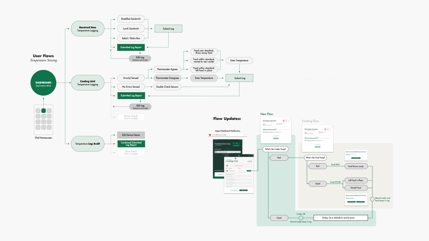
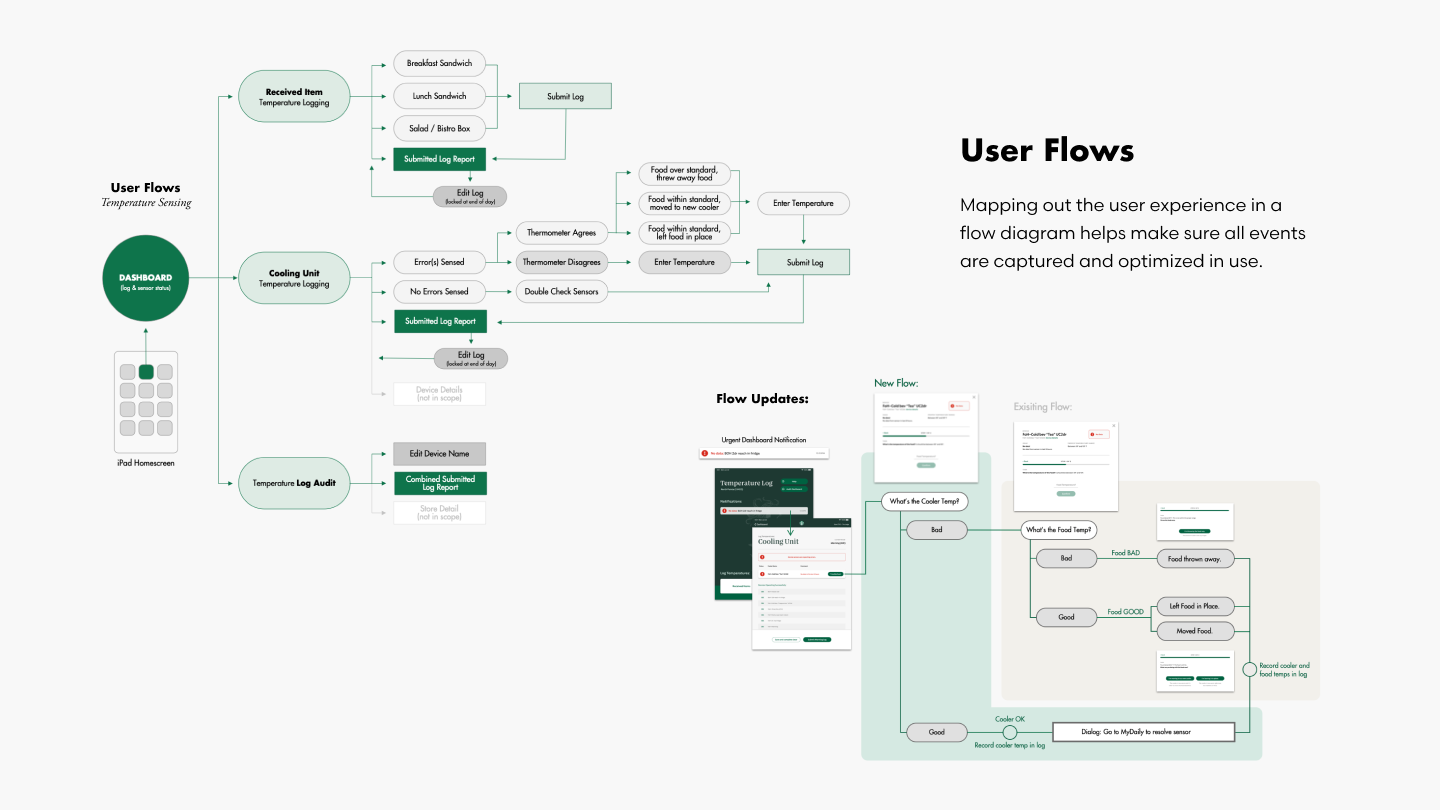
User Flows
Mapping out the user experience in a flow diagram helps make sure all events are captured and optimized in use.
UX Auditing and Wireframing
Like the start of many UX projects, we began by collaborating with Starbucks to clearly understand the problems they were facing. How could we notify store team members of immediate cooling issues sensed through IoT? How could we then educate those partners to see patterns in order to circumvent future trouble areas? Together we walked through the existing partner process of checking food and fridge temperatures, mapping the end-to-end experience for the user. We defined what successful interactions could be. And then identified ways that the mobile application could improve the process.
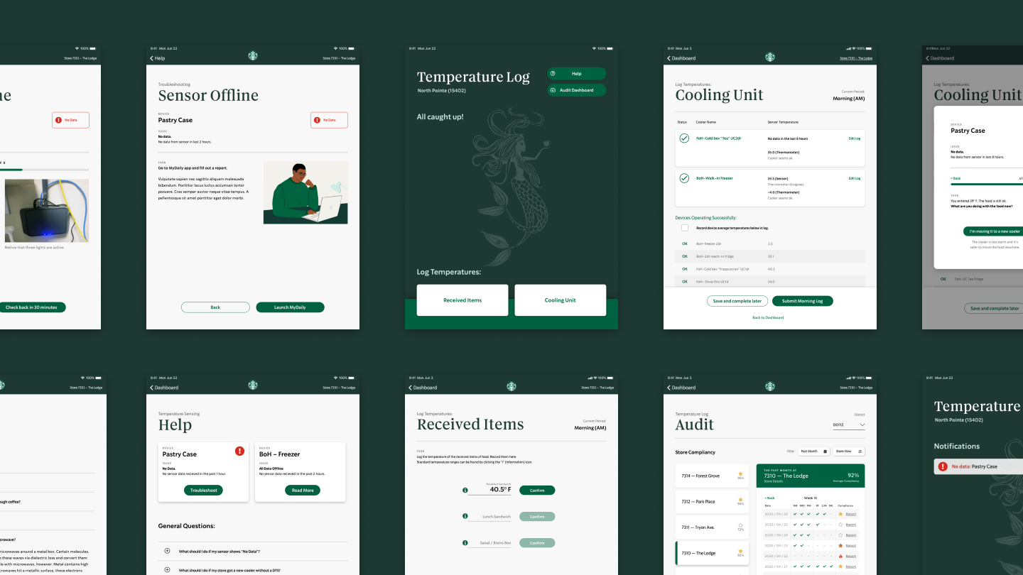
Through this open dialogue, we were able to get on the same page about the priorities and opportunities for the project. Once the Temp Sensing team approved the User Flows (seen above), we used that as the framework to map out the larger journey details. By designing wireframes page by page (below), defining the experience of launching the application to completing tasks becomes clearer. As we progressed, we had weekly check-ins with Starbucks and their engineers to make sure every situation was accounted for.
Functional Visual Design
Even though this application was designed to be simple, practical, and function-driven, Tactile believes great visual design is essential to usability by addressing information hierarchy and task highlighting. That’s why all of our UX Designers also work in visual design. Great products should not only look and function great but engage users with ease and enjoyment. And adding a little visual flourish can go a long way to helping people perceive more value in an experience (sometimes unconsciously). With this project, to increase the speed of delivery, our team took a hybrid approach of ramping up the fidelity of wireframes as we progressed.
With each check-in, designs evolved more naturally. Functionality and readability only improved when colors and visuals were added. By using a minimal color palette of warm tones with green, we maximized partner attention to needed tasks. Plus we sparingly used primary colors through icons to elevate statuses and issues. And by utilizing progressive disclosure of task steps, we minimized UI elements on screen to help with cognitive load. All of these small visual components led towards better usability for store partners.
Delivering Great
Results, Faster
and Efficiently
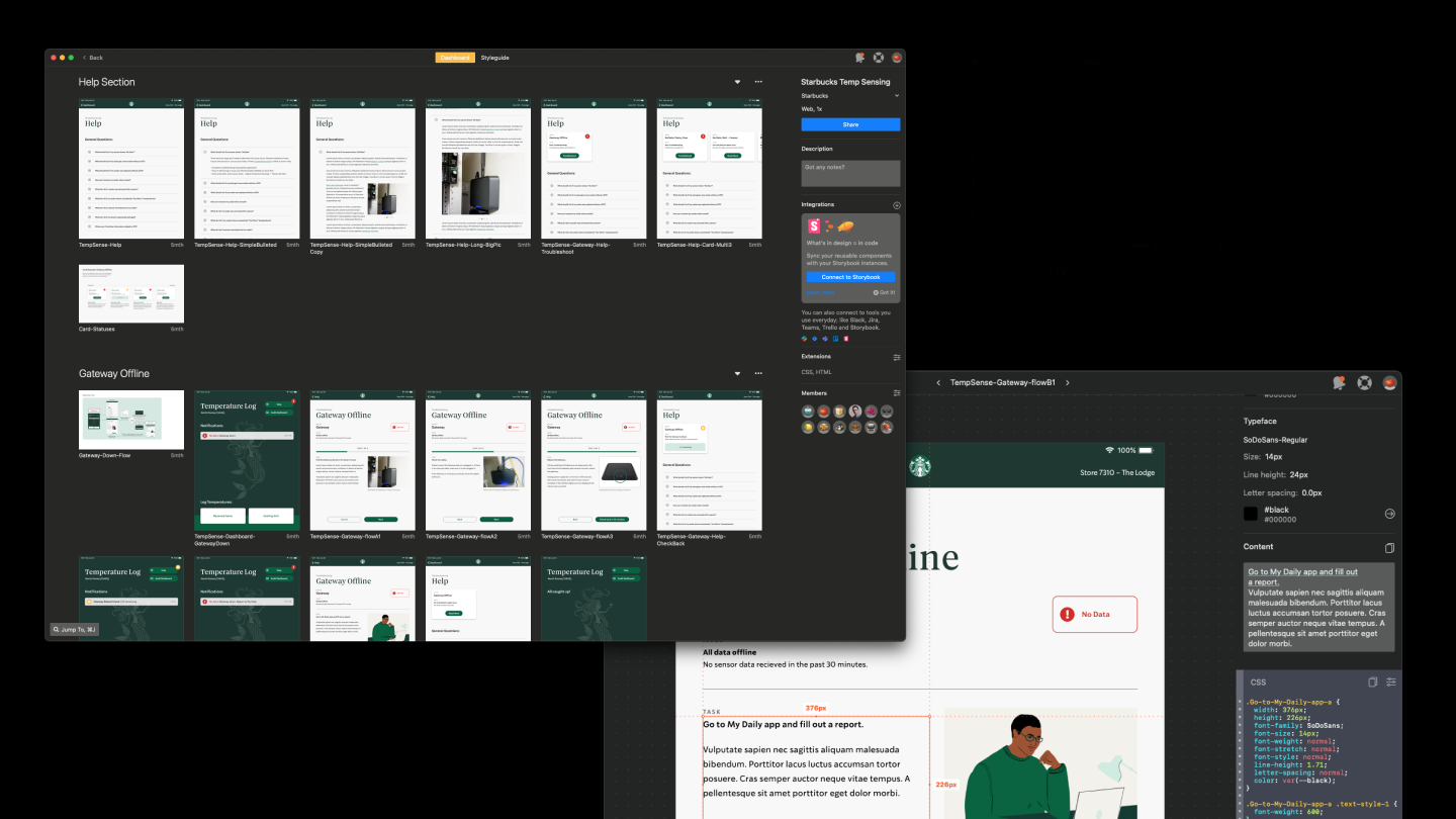
Presenting great designs (outputted from design software) is only a portion of the larger process of delivering results. Our designer and developer spent weeks collaborating directly with Starbucks engineers to ensure our vision became reality. From edge-case designs to remote software deployment on iPads in physical stores, we had to clearly communicate intentions.
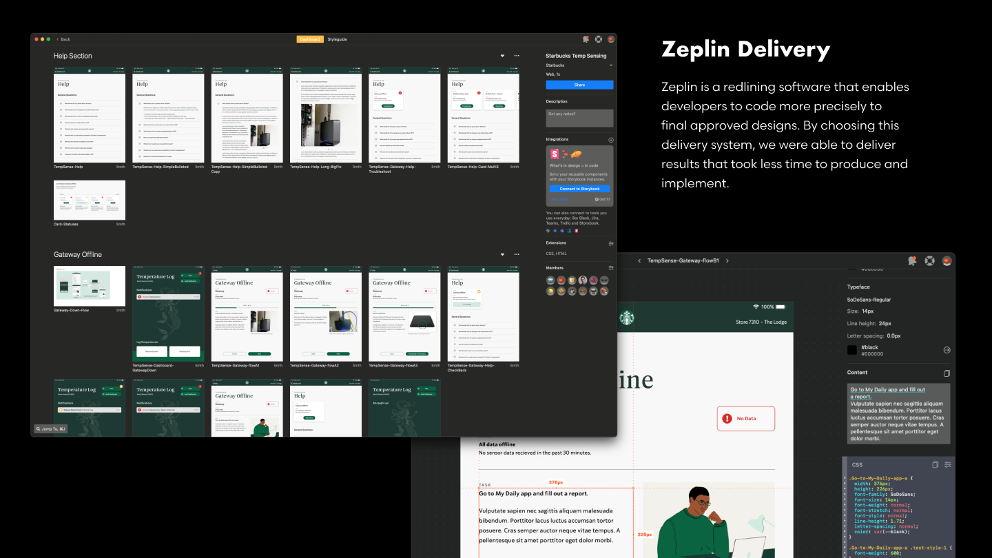
Zeplin Delivery
Zeplin is a redlining software that enables developers to code more precisely to final approved designs. By choosing this delivery system, we were able to deliver results that took less time to produce and implement.
Data that Empowers People
With the final Temperature Sensing application rolling, the success of the project is three-fold. Technicians harnessing IoT technology are now able to diagnose refrigeration problems quicker in each cafe using the software. Through the app, store crew members are able to maintain these IoT sensors in a way that empowers them to understand the technology, while not relying on paper
clipboard tallies. And store managers are able to audit the data, seeing how their store success compares to others. The entire rollout went over so well that Starbucks came back to Tactile later to expand the scope of the project, refining the experience and adding more features.
Quotes from Starbucks
“This is quality work and much better – great use of the space, and
aesthetically pleasing. Additionally, the user flow looks great, and the new headers are
perfect. Really nice. I look forward to seeing the implementation!”
— Principal Engineer at Starbucks
“Agreed, this is great! I can’t wait to get this in front of our store partners.”
— Project Manager at Starbucks
![]()
