STREETVIEW PART I
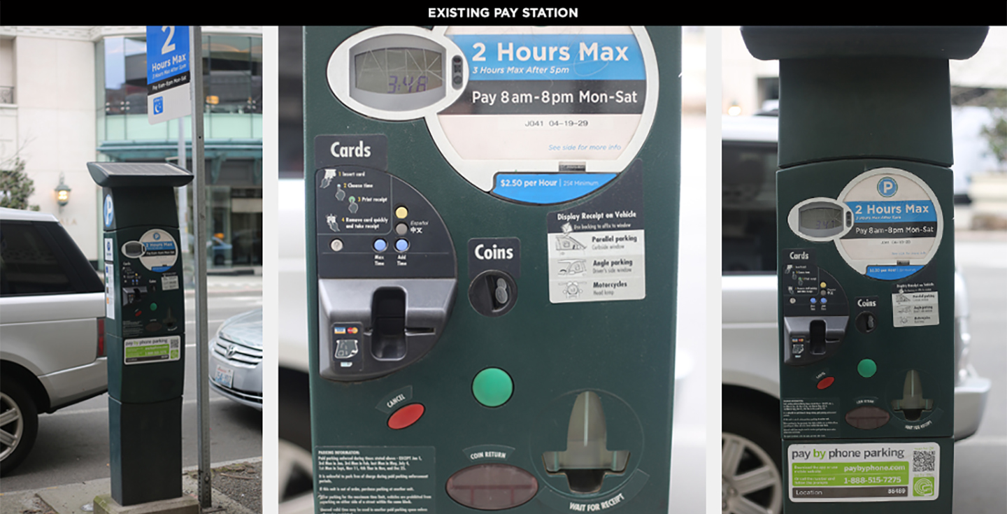
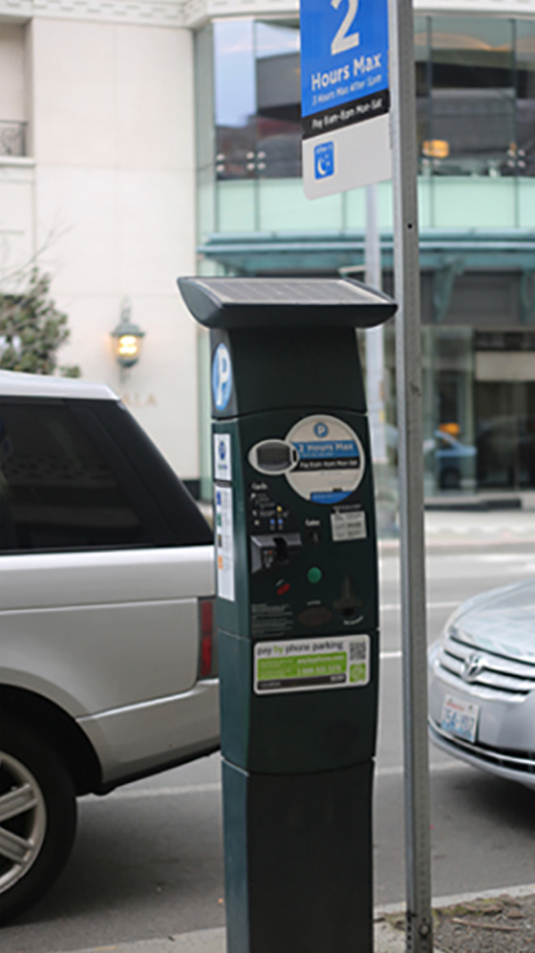
March 6, 2014Stuck card, connection failure, redundant charges—nearly every Seattle driver has had a frustrating experience with a parking pay station, including everyone on the Tactile team. So when the Seattle Department of Transportation (SDOT) announced their plan to replace 2,200 parking meters over the next two years, we took note. Then, when they installed seven trial pay stations along Fourth Avenue—literally in our front yard—with a request for public feedback, we got excited.
We wanted to understand why Seattle is investing in a parking meter overhaul in the first place. According to Project Lead Margo Polley, SDOT purchased a few rounds of pay stations over the last decade that simply haven’t held up to network demands and necessary upgrades. The city definitely feels some buyer’s remorse. While some of the meters appear new, most are more than eight years old and no longer connect reliably to process payments (thanks to outdated modems and low-bandwidth networks). SDOT had to beg the city council for $450,000 in 2013 for an urgent modem patch, and they’re trying to avoid sinking more city dollars into technology that will quickly become obsolete. Now they’re searching for a pay station that will not only meet the city’s basic needs, but also hold up for at least a decade.
The Tactile team designs tools that are both functional and attractive, with a heavy focus on creating a fluid, intuitive user experience. This applies to medical devices, professional–grade oscilloscopes, video game controllers and daily–use products not unlike our city parking meters. While constraints vary from project to project, the same principles of simplicity, ergonomics and intuitiveness apply across the board. Armed with these principles, we headed downstairs to Fourth Avenue to get to know the seven proposed pay stations.
On first glance, it was clear that SDOT was attempting to offer drivers more options, but we felt that most of the seven prototypes missed the mark in terms of usability. Issues we observed included:
• Feature creep—in trying to add a QWERTY keyboard, more time options and shortcuts, all of the pay stations ended up feeling cluttered. As a result, the primary function got lost and users ended up feeling overwhelmed.
• Inconsistent visual language—most of the pay stations had a mess of colors, button shapes and stickers, all of which created confusion. Icons seemed arbitrary, too, with no symbols in common with other Seattle signage.
• Weak information architecture—aside from hard–to–read type both on–screen and on the buttons (forget trying to read them at night), one of the biggest challenges we saw was a lack of visual organization and interaction flow. None of the pay stations presented a bold, simple set of 1–2–3 instructions for selecting time and payment that felt intuitive. There were extraneous buttons in strange places, or arrows pointing to other buttons that suggested reading more instructions on-screen—not exactly a clear and quick directive.
• Poor haptics—though it might seem like a minor detail, more responsive buttons would help assure the user that their selections have registered correctly. A “solid” button feel and tactile feedback could mean the difference between an error–free ticket purchase and accidental overpayment.
Of course it’s easy to see what isn’t working. Next, we want to learn more about the physical constraints, supplier options and necessary features that are driving the new pay station prototypes, and offer some constructive feedback. We love contributing to the conversation about something so close to home—and the “user experience” of a city we’re passionate about.